By Shaheer Malik · · 8 min read
How to Make a Before-and-After Video of Your App Redesign
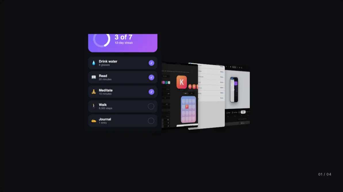
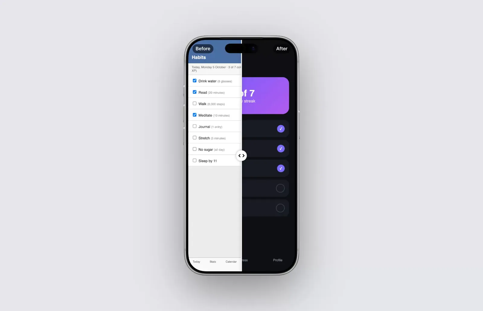
The clearest way to show an app redesign is the same screen, in the same state, inside one device, split by a line with the old version on the left and the new one on the right. As a still, the line sits in the middle; as a video, it sweeps across and back so the eye follows it from old to new. Keep it short (about 6 to 10 seconds), label the two sides Before and After, and export one file per shape: 9:16 for Stories and Reels, 1:1 or 4:5 for feeds, 16:9 for X, YouTube and your website.
You spent weeks on a redesign. Then you post a screenshot of the new version, and people see a nice screen, but they don't see what changed. The improvement only shows up next to what came before.
That's what before-and-after visuals are for. Done well, they make the difference obvious in a second. Done badly, they're two screenshots that make people play spot-the-difference.
This guide covers what to compare, the four common formats and when each one works, and how to make a before-and-after video where the split sweeps across the screen.
A disclosure: I make 240fps, the mockup and video tool I use for the example. The habit tracker in the pictures isn't a real app; I made both versions of the screen for this guide so I could show the technique without borrowing someone else's work.
Why does a before-and-after work better than a new screenshot?
A single screenshot asks people to judge your design on its own. A before-and-after gives them a reference point, so they judge the change instead. That's a much easier question to answer, and it's the one you actually want them to think about: is this better?
It also tells a story without words. A cluttered list next to a clean one says "we listened and simplified" faster than a paragraph of release notes. That's why redesign posts, case studies in portfolios and "what's new" announcements lean on this format.
It works best when the change is visible: a new layout, a new visual style, fewer elements, a clearer hierarchy. It works less well for changes people can't see on one screen, like faster loading or a new back end. For those, a short demo video says more.
What should I compare?
The single biggest mistake is comparing two different things. If the old screenshot shows an empty state and the new one shows a full list, people can't tell what's the design and what's the data.
Before you capture anything, line these up:
- The same screen. Today view against Today view, not old settings against new home.
- The same state. Same data, same date, same number of items, same user. Three of seven habits done in both.
- The same device and size. Capture both at the same resolution, so neither looks blurrier or bigger.
- The same light or dark mode, unless the redesign is adding dark mode. Then say so.
- The same crop. Status bar in both, or neither.
If the old version no longer exists in your app, check your App Store or Google Play listing history, old marketing pages or design files. A Figma frame of the old design is fine, as long as it shows what people really saw.
Which before-and-after format should I use?
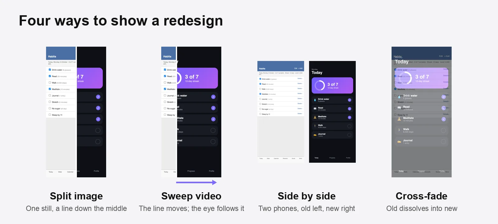
There are four common ways to show a redesign. They aren't equal.
| Format | What it looks like | Strengths | Weaknesses | Best for |
|---|---|---|---|---|
| Split image | One device, a line down the middle | One file, works everywhere, compares in place | Each side shows only half the screen | Blog posts, case studies, X, LinkedIn |
| Sweep video | The split line moves across and back | Shows both sides in full; motion catches the eye in a feed | Needs a video, a few seconds to watch | Reels, Stories, TikTok, launch posts |
| Side by side | Two devices, old left, new right | Both screens whole and visible at once | Eyes jump between two phones; each is smaller | Portfolios, slide decks, wide formats |
| Cross-fade | The old screen dissolves into the new | Smooth and simple | The moment of change is hard to see; mid-fade looks muddy | Short transitions inside a longer video |
My default is a split image for anything static and a sweep video for anything that plays. Side by side is the fallback when the two designs are so different that half of each makes no sense.
How do I make a before-and-after sweep video?
Here's the full process in 240fps, from two screenshots to an exported video. Any tool that can put an image in a device and animate a mask can do the same; this is just the quickest way I know.
1. Put the new screen in a device
Open the editor, pick a device (I used the iPhone 17 Pro), and drop in the new screenshot. Paste it with ⌘V, drag it onto the canvas, or click the empty screen.
2. Add the old screen as "before"
Under the media slots, click Before / after and choose the old screenshot. The device now shows the old screen on the left and the new one on the right, with a white line, a round handle, and Before and After labels in the top corners.
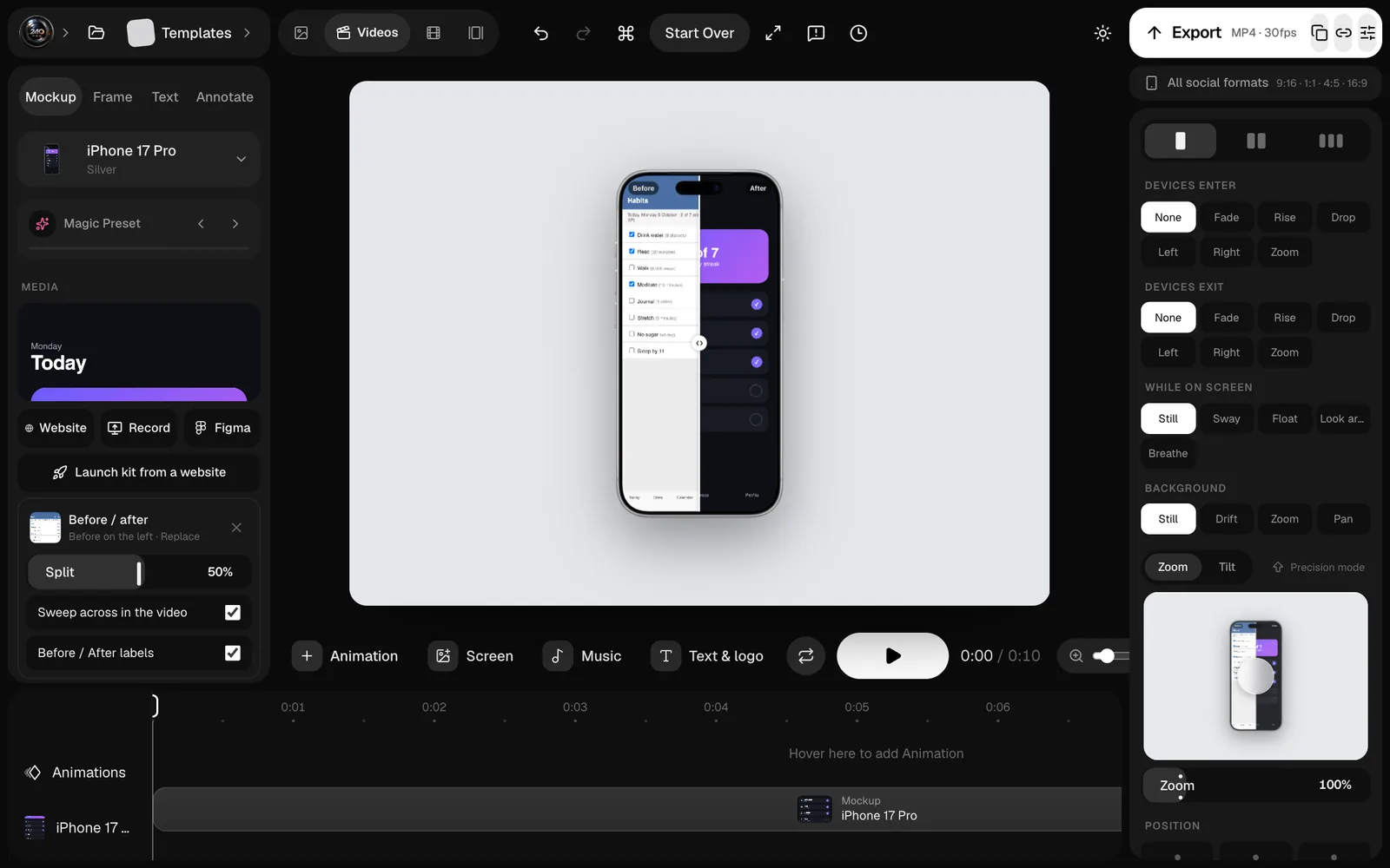
Split sets where the line rests, from 5% to 95%. Fifty is right for most redesigns; move it if the interesting part of the new design sits on one side.
3. Switch to Videos and turn on the sweep
Flip the editor to Videos. In the Before / after panel, Sweep across in the video makes the line move: it starts at your split, swings 40% of the screen each way, and goes across and back every four seconds. In a 10-second video that's two and a half full sweeps, so a viewer who joins late still sees both sides.
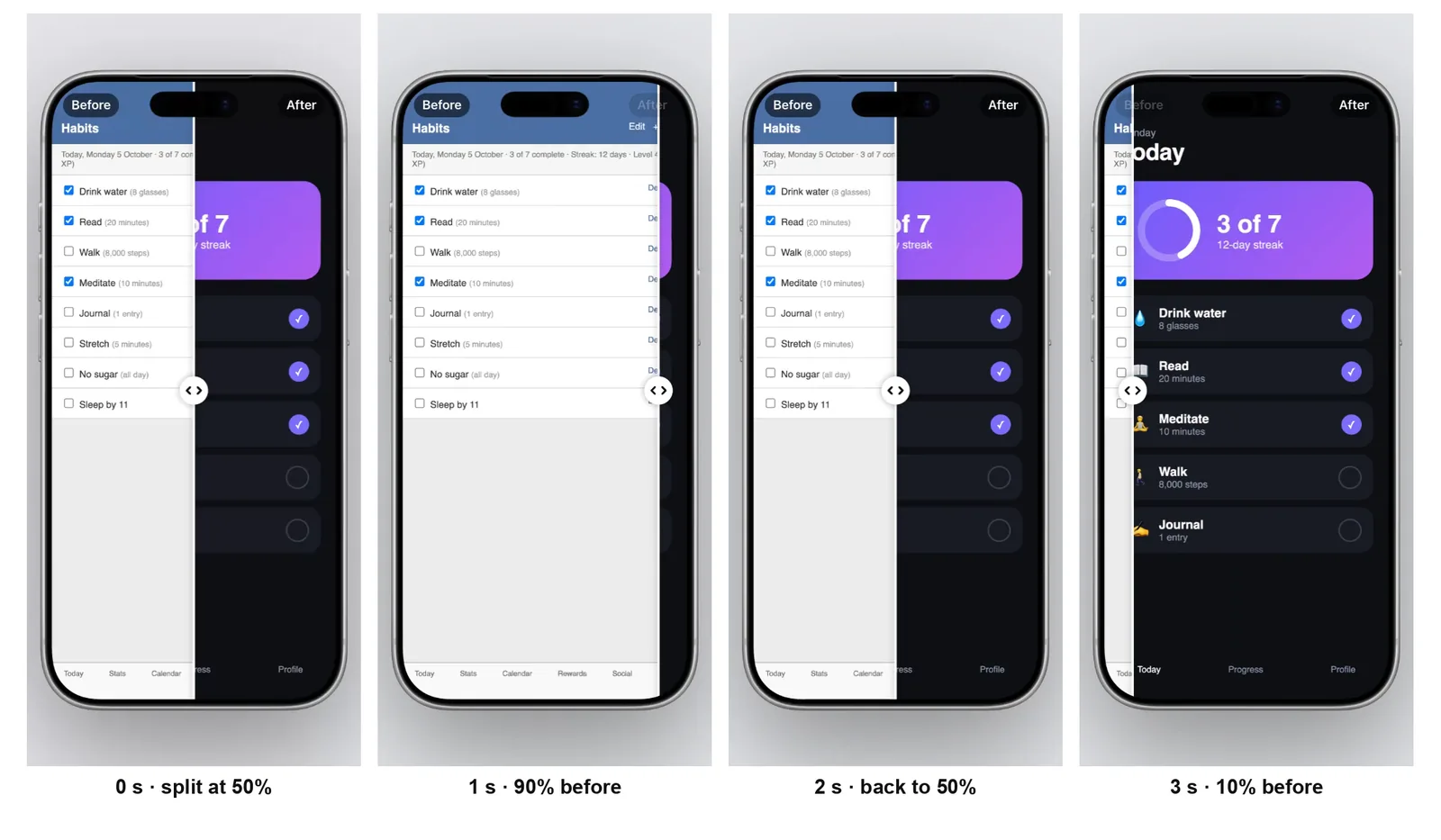
The labels fade as the line reaches them, so "Before" never sits on top of the new design.
4. Add context, then export
A before-and-after on its own can still leave people wondering what they're looking at. Two small additions help:
- A headline in the Text tab: what changed, in a few words ("Today, redesigned").
- Your logo, so it's yours when it gets shared.
Then export an MP4. If you're posting to several places, All social formats renders 9:16, 1:1, 4:5 and 16:9 in one go, with the layout adapted to each shape rather than cropped.
What are the common before-and-after mistakes?
- Different data on each side. It makes the comparison about content, not design. Use the same state.
- No labels. Some redesigns look like regressions to people who liked the old one. Tell them which is new.
- Before on the right. People read left to right and expect time to flow that way. Put the old version on the left.
- Too long. One screen, one change, under ten seconds. If you redesigned five screens, make five short clips or a sequence, not one long one.
- Tiny text. The old version's small type is part of the point, but the new version must be readable at phone size. Zoom the camera in if needed.
- Unfair "before". Don't pick the old version's worst moment, like an error state or a half-loaded screen, to make the new one look better. People notice.
Where should I post it?
Wherever the people who used the old version will see it:
- Your changelog or "What's new" post, as a still split image at the top.
- The App Store and Google Play "What's New" text can't hold images, but your screenshots can show the new design; keep the before-and-after for social.
- X and LinkedIn: a 16:9 or square sweep video, with one sentence on why you changed it.
- Instagram and TikTok: a 9:16 sweep, with the headline near the top so it isn't hidden behind the caption.
- Your portfolio or case study: a split image per screen, with a sentence on what each change fixed.
- Product Hunt, if you're relaunching: a before-and-after makes a strong gallery image. See how to make a Product Hunt launch gallery.
FAQs
How do I make a before and after slider video?
Put the new screenshot in a device, add the old one as the "before" image, and animate the dividing line so it moves across the screen and back. In 240fps that's the Before / after panel with "Sweep across in the video" turned on in Videos mode.
How long should a before-and-after video be?
About 6 to 10 seconds per screen: long enough for the line to sweep across and back at least once, short enough that people watch to the end.
Should the old design go on the left or the right?
On the left. People read left to right and expect the earlier version first, and it matches how before-and-after photos are usually shown.
Can I show a before and after of a website, not an app?
Yes. The same rules apply: same page, same state, same width. Use a browser or laptop frame instead of a phone, and capture both versions at the same window size.
What if I don't have screenshots of the old version?
Look in your old App Store or Google Play screenshots, earlier marketing pages, design files, or the Wayback Machine for websites. A design file is fine if it matches what people actually saw.
Last updated: 5 October 2026. The example screens are illustrations made for this guide. Feature details describe 240fps as of 5 October 2026.