By Shaheer Malik · · 10 min read
App Icon Sizes for iOS and Android (2026): Every Size You Need
For iPhone, iPad and Mac you design one 1024 × 1024 pixel icon, square and unmasked, and Xcode generates every smaller size from it; Apple Watch uses 1088 × 1088 and Apple TV 800 × 480. On Android, the launcher icon is an adaptive icon made of two 108 × 108 dp layers with the logo inside the central 66 × 66 dp, plus a 48 dp legacy icon at five densities (48 to 192 px). Google Play needs a separate 512 × 512 pixel, 32-bit PNG of up to 1024 KB.
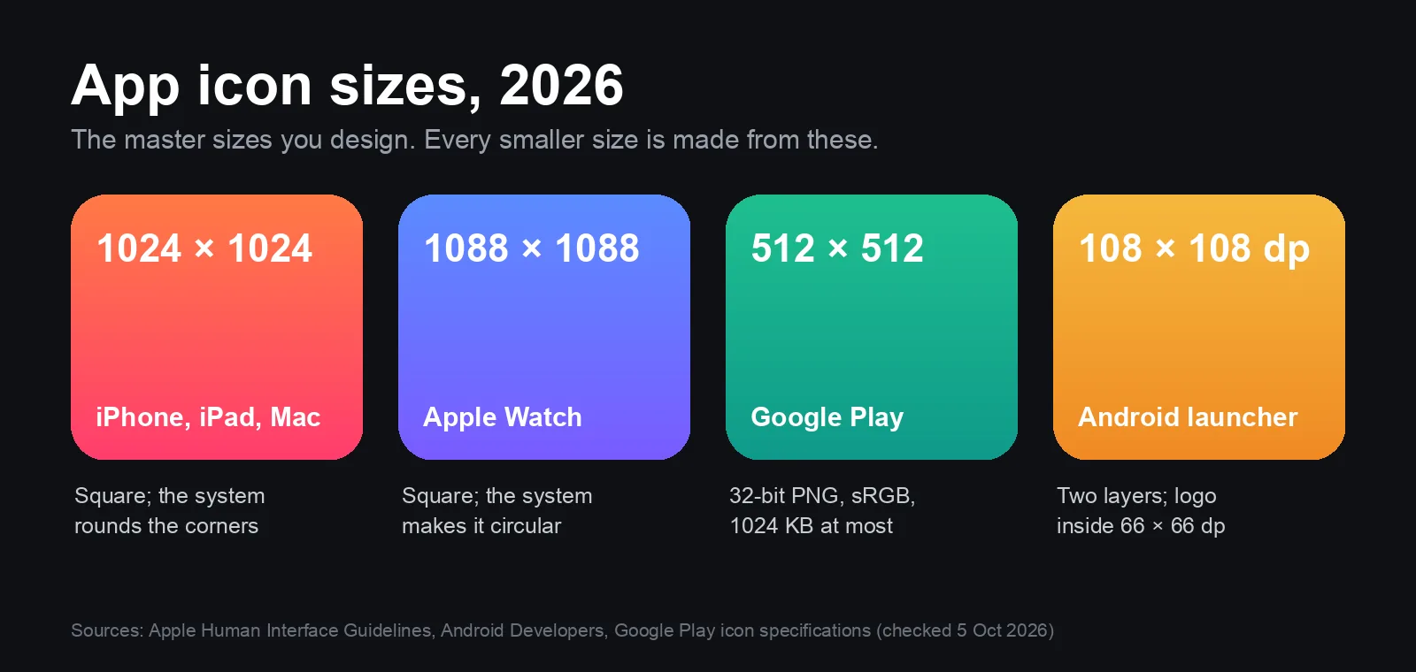
App icon sizes used to be a spreadsheet: twenty-odd PNGs for iOS, another dozen for Android, and a few more for the web. In 2026 it's much simpler, because both Apple and Google now generate most sizes for you. What's left is a short list of master sizes, a few rules about corners and safe zones, and one store-only icon on each platform.
This guide lists every size you actually need, where each one comes from, and the mistakes that make icons look wrong once the system crops them.
A disclosure first: I make 240fps, which has an app icon maker, and I use it for one example below. Every size and rule here comes from Apple's and Google's own documentation, which I read on 5 October 2026 and link to in each section.
What are the app icon sizes in 2026?
Here is the whole list in one table. The "master" is the file you design; everything smaller is generated from it.
| Platform | Master size | Shape you supply | What the system does |
|---|---|---|---|
| iPhone, iPad, Mac | 1024 × 1024 px | Square, unmasked | Rounds the corners, makes every smaller size |
| Apple Watch | 1088 × 1088 px | Square | Masks it to a circle |
| Apple Vision Pro | 1024 × 1024 px | Square, layered | Masks it to a circle, adds depth |
| Apple TV | 800 × 480 px | Rectangle, layered | Rounds the corners, adds parallax |
| Android launcher (adaptive) | 108 × 108 dp, two layers | Square layers | Applies the phone maker's mask shape |
| Android launcher (legacy) | 48 × 48 dp | Square | Used on older Android versions |
| Google Play listing | 512 × 512 px | Full square | Rounds the corners (30% radius), adds a shadow |
| Web favicon / home screen | 32, 180, 192 and 512 px | Square | Browser and OS decide |
The Apple rows come from the Human Interface Guidelines on app icons, the Android rows from Android Developers' adaptive icons and pixel densities pages, and the Google Play row from Google's icon design specifications. The web sizes are the common ones, not a store rule.
What size is the iOS app icon?
1024 × 1024 pixels. Apple's specifications table lists that one layout size for iOS, iPadOS and macOS, with the layout shape "Square" and the shape after masking "Rounded rectangle".
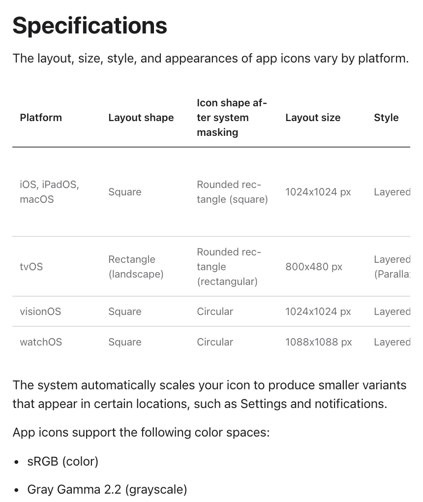
You don't need the long list of 180, 120, 87 and 58 pixel files any more. Apple's Xcode documentation, Configuring your app icon, says iOS, iPadOS, tvOS and watchOS apps "can auto-generate all icon variations from a single 1024×1024 pixel image", and that this is the default for new projects. The individual sizes still exist under the All Sizes option, for teams that want a hand-tuned small icon.
Three rules matter more than the size:
- Supply a square. Apple asks for "square layers so the system can apply rounded corners", and warns that pre-masked layers make edges look jagged and spoil the highlight effects. If you round the corners yourself, the system rounds them again.
- Keep it full-bleed. If you import a background layer, Apple says to make it "full-bleed and opaque". A transparent corner has nothing behind it once the mask is applied.
- Keep the important part centred. The system adjusts corners and masks, so anything near the edges can be cut.
Dark, clear and tinted icons
In iOS, iPadOS and macOS, people can show their Home Screen icons in default, dark, clear or tinted appearances, and Apple's table lists six variants (default, dark, clear light, clear dark, tinted light, tinted dark). You can design each one, and the system generates any you leave out. In Xcode you supply the dark icon with a transparent background, so the system's background shows through, and the tinted icon as a grayscale image.
For the layered Liquid Glass style, with its highlights and translucency, Apple's tool is Icon Composer, which comes with Xcode: you bring the foreground layers, set the background and effects there, and export one file for Xcode. A flat 1024 × 1024 PNG still works; layers just give the system more to animate.
Apple Watch, Vision Pro and Apple TV
- Apple Watch: 1088 × 1088 px, square. The system makes it circular, so keep content well inside the corners. Apple also advises against a black background on watchOS, because it blends into the display.
- Vision Pro: 1024 × 1024 px, with a background layer and one or two layers on top, which the system turns into a 3D, circular icon.
- Apple TV: 800 × 480 px, landscape, built from two to five layers for the parallax effect when it's focused.
What size is the Android app icon?
Android has two launcher icons, and you should ship both.
The adaptive icon: 108 × 108 dp
Since Android 8 (API 26), the launcher icon is an adaptive icon: a foreground layer and a background layer, each 108 × 108 dp. Each phone maker applies its own mask, a circle on one launcher and a squircle on another, and can move the layers for parallax.
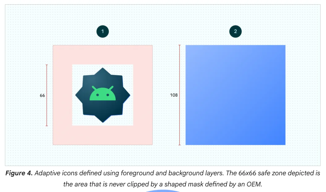
Google's rules, from the adaptive icons page:
- "Size all layers to 108x108 dp."
- The inner 66 × 66 dp is the safe zone, "never clipped by a shaped mask defined by an OEM".
- The logo should be at least 48 × 48 dp and no more than 66 × 66 dp.
- The outer 18 dp on each side is reserved for masking and effects such as parallax.
- Layers can be vectors or bitmaps, "though vectors are preferred".
For themed icons (Android 13 and later), add a third, monochrome layer. The system tints it to match the person's wallpaper. Without it, your icon is the one that stays colourful on a themed Home Screen.
If you export the layers as PNGs rather than vectors, 108 dp works out at 108, 162, 216, 324 and 432 px across the five densities.
The legacy icon: 48 dp at five densities
Older Android versions, and some launchers, still use a plain square icon. Google's guidance, in Making Beautiful Android App Icons, is that launcher icons are 48 × 48 dp, and the pixel densities page gives the scale factors that turn 48 dp into pixels.
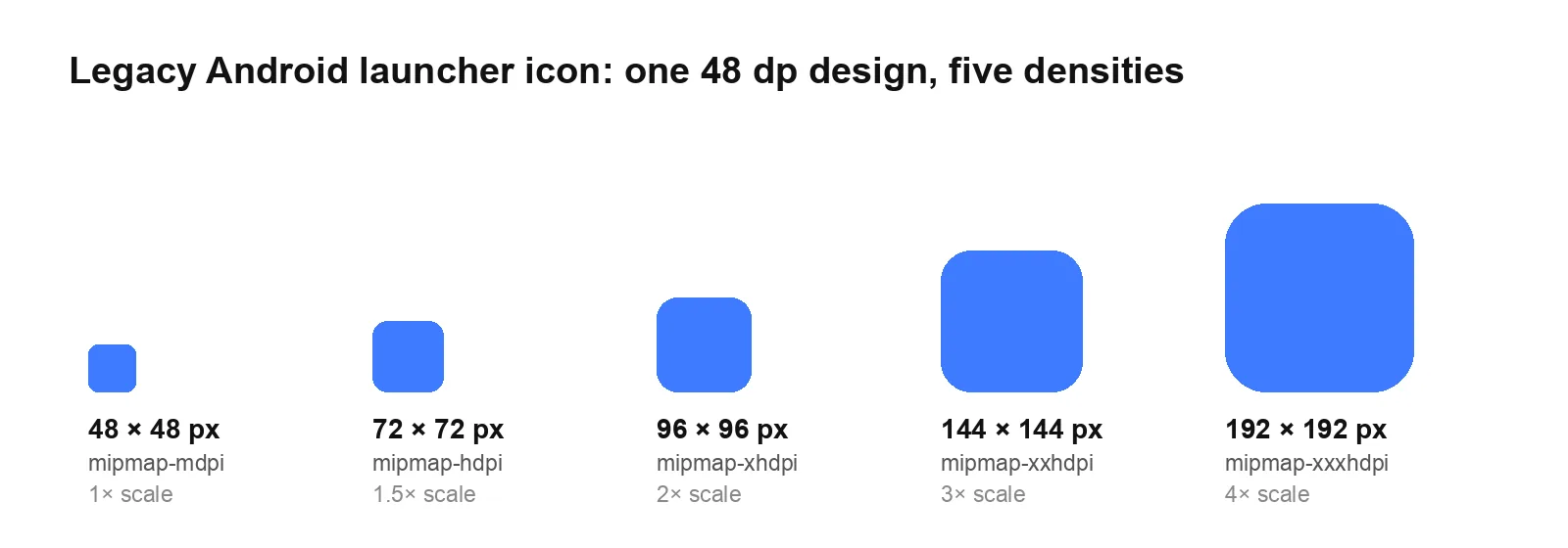
| Folder | Scale | Legacy icon | Adaptive layer |
|---|---|---|---|
| mipmap-mdpi | 1× | 48 × 48 px | 108 × 108 px |
| mipmap-hdpi | 1.5× | 72 × 72 px | 162 × 162 px |
| mipmap-xhdpi | 2× | 96 × 96 px | 216 × 216 px |
| mipmap-xxhdpi | 3× | 144 × 144 px | 324 × 324 px |
| mipmap-xxxhdpi | 4× | 192 × 192 px | 432 × 432 px |
Put launcher icons in the mipmap folders, not drawable. Google explains that some launchers show the icon up to 25% larger than the device's density, and only mipmap folders keep every density in the APK.
What size is the Google Play icon?
512 × 512 pixels, separate from the icon inside your app. Google's icon design specifications set it out:
| Requirement | Value |
|---|---|
| Size | 512 × 512 px |
| Format | 32-bit PNG |
| Colour space | sRGB |
| Maximum file size | 1024 KB |
| Shape | Full square; Google applies a corner radius of 30% of the icon size |
| Shadow | None; Google adds its own drop shadow |
Two easy mistakes: rounding the corners yourself (Google rounds them again, so you get a double curve) and adding a drop shadow (Google adds one too). Google also rules out text or graphics that show a ranking, promote deals or imply you're part of a Play programme.
Which icon mistakes look worst after masking?
Most bad icons are fine at 1024 pixels and fall apart once the system crops and shrinks them:
- Pre-rounded corners. Both Apple and Google want a square and round it themselves.
- A logo that touches the edges. On Android, anything outside 66 dp can be cut by a circular mask.
- Thin lines and small text. Apple warns that thin line weights lose detail at small sizes, and that text "is often too small to read easily". Your app's name already sits under the icon.
- Screenshots of your interface. Apple specifically advises against using app screenshots or standard interface elements in an icon.
- Custom shadows and glows. Both platforms add their own lighting; yours will fight with it.
- A dark icon that's just inverted. Apple suggests starting from your light icon and choosing complementary colours, rather than flipping it.
How do I make every size at once?
You can do it by hand: design the 1024 master in Figma or Sketch, export it for Xcode, build the adaptive layers in Android Studio's Image Asset tool, and export the 512 for Google Play separately. That works, but it's three tools and a lot of exports to keep in sync.
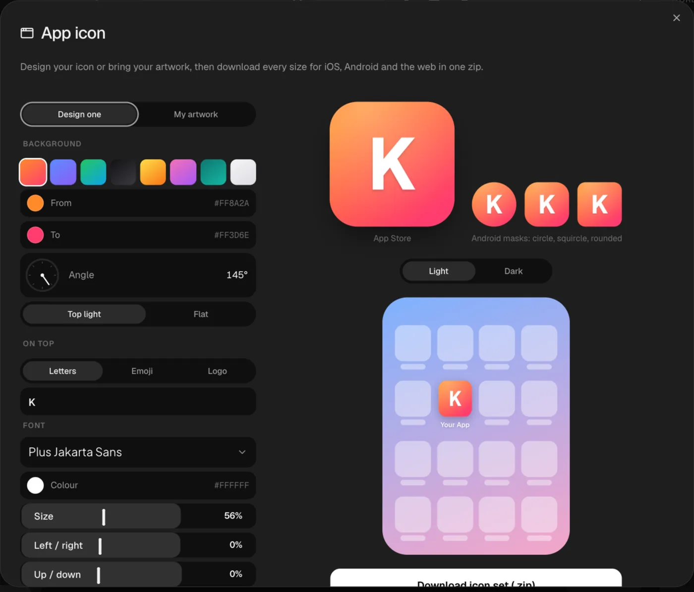
In 240fps, the App icon maker (in the Screenshots studio) does it in one pass. Design the icon (a gradient with letters, an emoji or your logo) or bring your finished artwork, check it against the App Store shape, three Android mask shapes and a Home Screen in light and dark mode, then download one zip with:
- iOS: an
AppIcon.appiconsetwith the single 1024 × 1024 icon and itsContents.json, ready to drop into Xcode, plus the App Store 1024 and the older individual sizes from 180 down to 20 px. - Android: legacy and round launcher icons in all five
mipmapfolders, the adaptive foreground and background layers with the logo inside the 66 dp safe zone, theic_launcher.xmlthat ties them together (with a monochrome layer for themed icons), and the Play Store 512. - Web: a 32 px favicon, a 180 px Apple touch icon and 192 and 512 px PWA icons.
Designing is free; downloading the icon set is part of 240fps Monthly ($7 a month) or Lifetime ($39 once). Open the icon maker to try it.
FAQs
What size should an app icon be?
Design it at 1024 × 1024 pixels for iPhone, iPad and Mac, and Xcode makes every smaller size. For Android, make 108 × 108 dp adaptive layers and a 48 dp legacy icon, and a 512 × 512 pixel PNG for the Google Play listing.
Do I still need all the small iOS icon sizes?
No. Apple's Xcode documentation says apps can generate every icon variation from a single 1024 × 1024 image, and that's the default for new projects. You only need the small sizes if you choose All Sizes to hand-tune them.
Should my app icon have rounded corners?
No. Supply a square. Apple and Google both apply the rounded mask themselves; rounding it first gives a doubled, jagged edge.
What is the safe zone on an Android icon?
The central 66 × 66 dp of the 108 × 108 dp adaptive icon. Google says that area is never clipped by a phone maker's mask, so keep your logo inside it.
Can my Google Play icon be the same file as my app's icon?
It can be the same design, but it's a separate upload: a 512 × 512 pixel, 32-bit PNG in sRGB, up to 1024 KB, as a full square without your own rounded corners or shadow.
Last updated: 5 October 2026. Sizes and rules are from Apple's Human Interface Guidelines (App icons) and Xcode documentation (Configuring your app icon), Android Developers (Adaptive icons; Support different pixel densities), Google's Play icon design specifications, and the Android Developers Blog, all read on 5 October 2026.