By Shaheer Malik · · 7 min read
Google Play Feature Graphic: Size, Rules and an Example (2026)
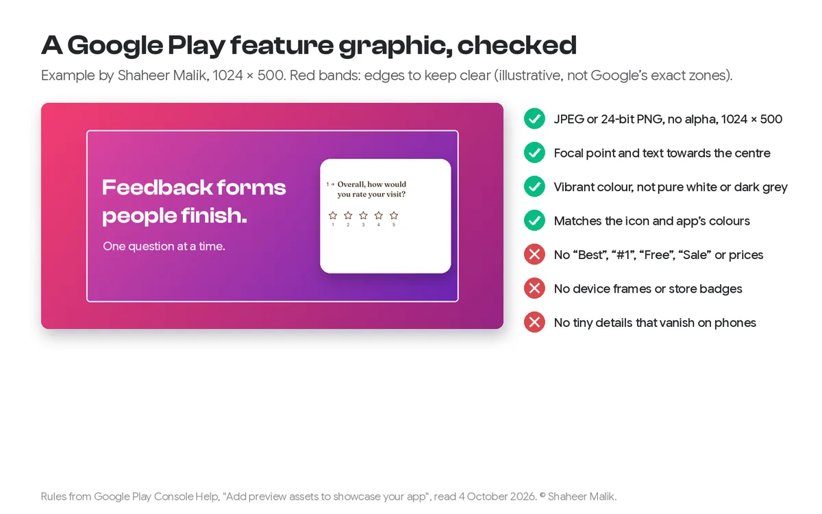
A Google Play feature graphic must be 1024 × 500 pixels, saved as a JPEG or a 24-bit PNG with no transparency, and you need one to publish your store listing. Google recommends keeping the focal point and any text near the centre, using vibrant colours rather than pure white or dark grey, and avoiding device frames, store badges and words like "Best", "#1" or "Free".
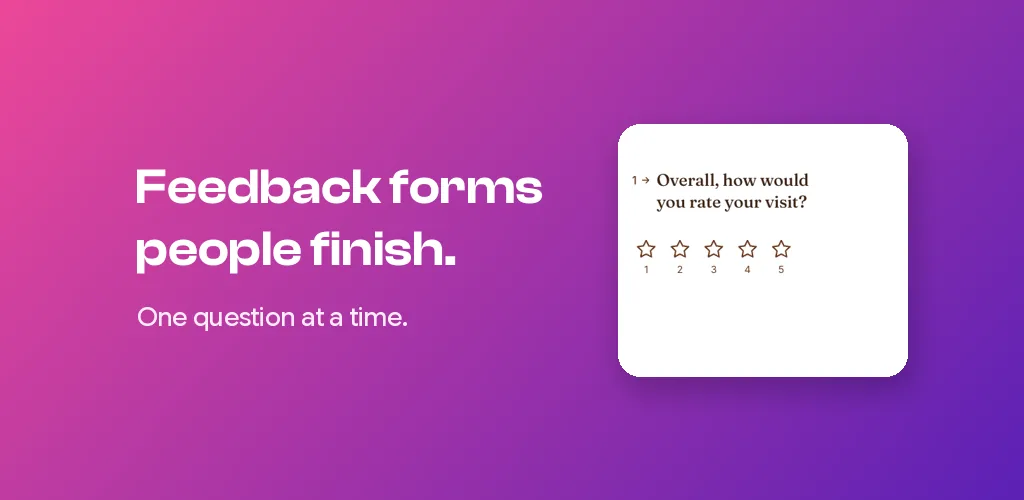
Every Android app needs one image that iOS developers never make: the feature graphic. It's a wide banner, 1024 by 500 pixels, and Google Play won't publish your store listing without it. Google shows it in large-format collections, ads and as the cover of your preview video, so it's worth more than the five minutes most developers give it.
This guide covers the exact requirements, the design rules Google publishes, the mistakes that get a graphic left out of featured placements, and a quick way to make one.
A disclosure first: I make 240fps, a mockup and screenshot tool, and I use it for the example. Google's rules come from its Play Console Help page, read on 4 October 2026; I quote them where it matters.
What are the feature graphic requirements?
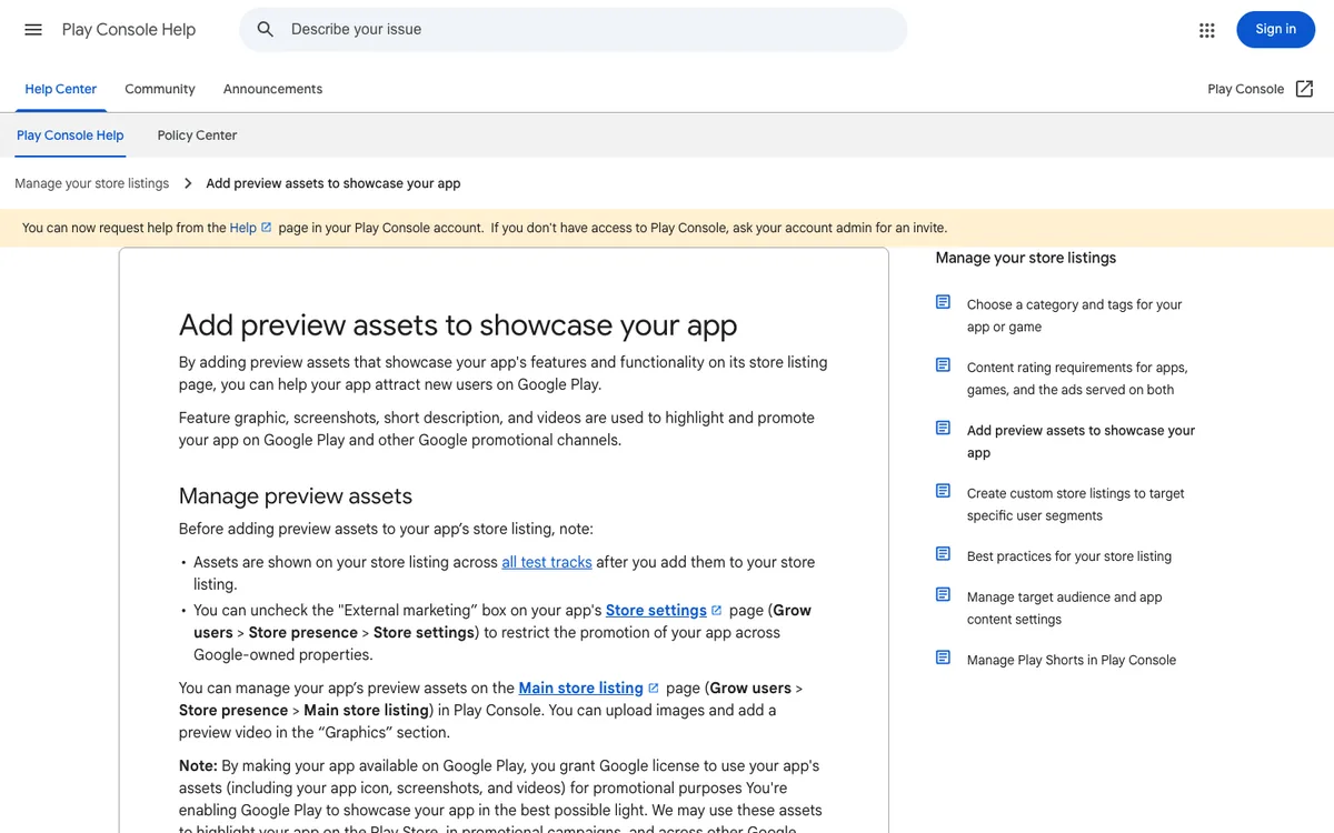
Two hard requirements, both from Google's Play Console Help page, Add preview assets to showcase your app:
| Requirement | Value |
|---|---|
| Dimensions | 1024 × 500 pixels |
| Format | JPEG or 24-bit PNG |
| Transparency | Not allowed (no alpha channel) |
| Required? | Yes, to publish your store listing |
| Where it appears | Cover of your preview video; large-format app collections, including ads; game recommendation groups |
A PNG exported from a design tool often carries an alpha channel even when nothing is transparent. Play Console rejects it. If that happens, export as JPEG, or flatten the PNG onto a solid background before you upload.
What does Google recommend for the design?
The rest of Google's guidance is a list of recommendations, and following them matters. Google says that ignoring the focal point and cutoff-zone advice can make your app ineligible for some formats. In short:
- Show the experience. Convey what using the app or game feels like, and the core value, not just your logo.
- Don't repeat your icon. Prominent branding that looks like your app icon duplicates it, because the two are often shown side by side. Extend the brand instead.
- Keep it simple. Fine details won't be visible on many phone screens.
- Centre the important part. Keep the brand logo, app name, main slogan and main UI towards the centre. Edge areas may be cut off depending on the format, and some formats add UI overlays.
- Push background detail to the edges. Decoration belongs at the sides, not the subject.
- Use vibrant colour. Google specifically says to avoid pure white, black and dark grey, which blend into the Play Store's background.
- Match your icon and app. A similar or complementary colour theme makes the connection instant.
- Localise. Translate any text for the markets you sell in.
- Add alt text. Describe the graphic for screen-reader users, in 140 characters or less.
What should a feature graphic not include?
Google lists things to avoid, and several catch people out:
- Performance and promotion claims. No Play rankings, testimonials, awards, prices or promotions. Google names the words to avoid: "Best", "#1", "Top", "New", "Free", "Discount", "Sale" and "Million Downloads".
- Device imagery. This is the one most developers get wrong. Google says to avoid device frames because they date quickly and can alienate some users. Show the screen itself, not a phone holding it.
- Store badges. No Google Play or other store icons.
- Third-party characters or logos you don't have permission to use.
- Time-sensitive content that will go stale, unless you swap it out on schedule, such as a holiday version.
The device rule is the opposite of what works on a website or in a pitch deck, where a phone frame helps people recognise a product. On Google Play, your listing already says it's an app. My guide to Google Play screenshots covers the screenshot rules, which are different.
How do I make a feature graphic?
Set a 1024 × 500 canvas, put one clear message on the left or centre, show one piece of real UI without a device frame, and export a JPEG. Here's how I made the example at the top of this post:
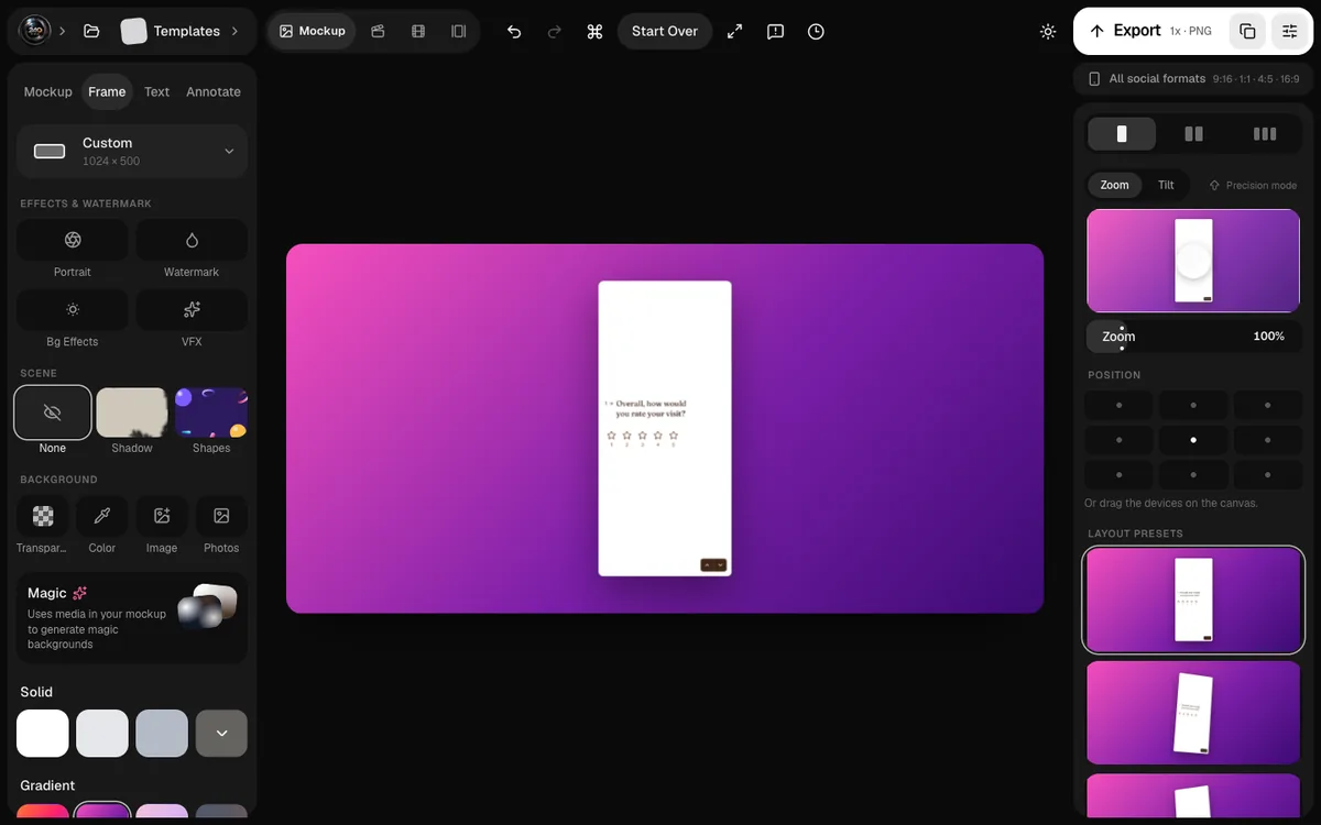
- Set the size. In 240fps, open the editor without a device frame, go to the Frame tab, open the size menu and type 1024 by 500. Figma, Canva or any image editor works the same way: a custom canvas at those dimensions.
- Pick a background. Choose a vibrant colour or gradient that matches your icon. The example uses pink to purple; avoid white and dark grey.
- Add one screen. Drop in the screen that best shows your app's value. Crop to the part that matters, because small UI won't be readable at phone size.
- Write one line. Six words or fewer, saying what the app does for people. Put it left of centre so it stays inside the safe area.
- Check the edges. Nothing important should touch the outer edges. Leave a generous margin all round.
- Export as JPEG (or a PNG without transparency) at 1024 × 500, and upload it in Play Console under Grow users > Store presence > Main store listing, in the Graphics section.
In 240fps, designing is free; exporting needs a plan ($39 once or $7 a month). The same canvas can also make your Google Play screenshot set.
Feature graphic vs App Store: what's the difference?
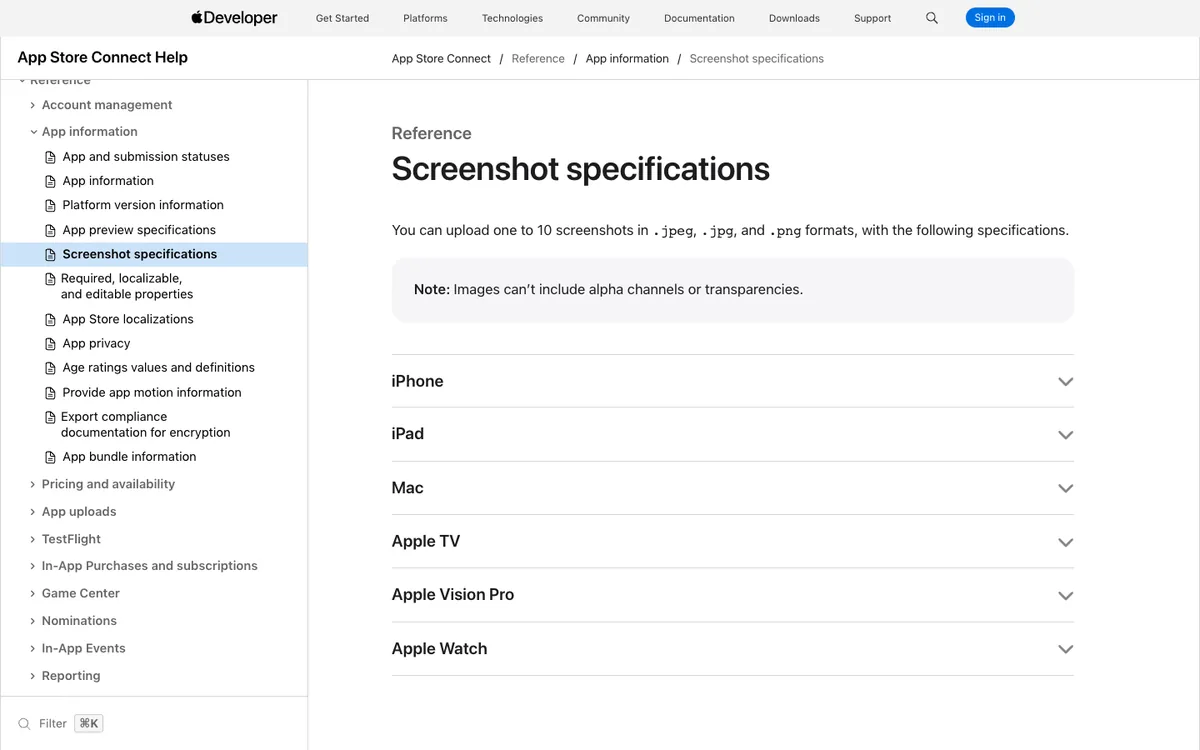
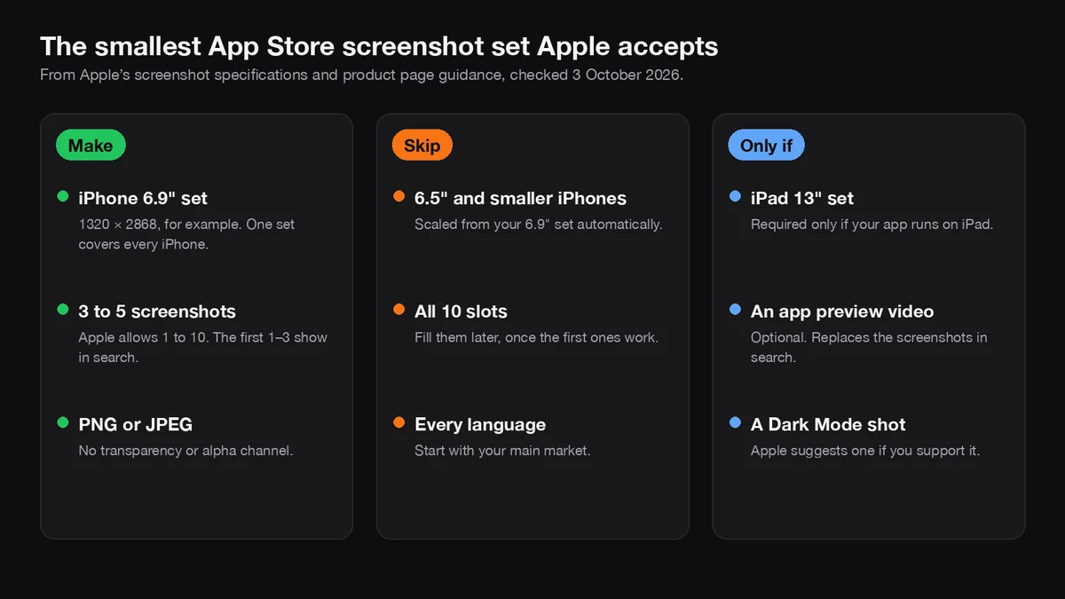
Apple has no equivalent banner. On the App Store, your screenshots and optional app preview video do this job; Apple may ask for separate artwork only if it chooses to feature your app. That's why iOS-first teams often forget the feature graphic until Play Console blocks their listing.
| Google Play | Apple App Store | |
|---|---|---|
| Banner image | 1024 × 500 feature graphic, required | None for regular listings |
| Device frames in marketing images | Avoid in the feature graphic | Allowed in screenshots, but screenshots must show the app in use |
| Video cover | The feature graphic covers your preview video | A poster frame from the video |
| Text on the image | Allowed; localise it; no "Best", "#1" or "Free" | Allowed on screenshots |
My post on App Store screenshot rules covers Apple's side.
A checklist before you upload
- [ ] 1024 × 500 pixels exactly.
- [ ] JPEG, or PNG with no alpha channel.
- [ ] One message, readable on a phone.
- [ ] Focal point and text near the centre, clear of the edges.
- [ ] Vibrant colours that match the icon; no pure white, black or dark grey.
- [ ] No device frames, badges, prices, rankings, awards or "Free".
- [ ] Translated for each market where you localise the listing.
- [ ] Alt text written, 140 characters or less.
FAQs
What size is the Google Play feature graphic?
1024 pixels wide by 500 pixels high. Google accepts it as a JPEG or a 24-bit PNG, with no transparency.
Is the feature graphic required on Google Play?
Yes. Google's Play Console Help says you must provide a feature graphic to publish your store listing.
Can I put a phone mockup in my feature graphic?
Google recommends against it: device imagery can become outdated quickly or alienate some users. Show the app's screen or artwork without a device frame instead.
Can the feature graphic have text?
Yes, as long as it isn't a ranking, price, promotion or claim like "Best", "#1" or "Free". Keep it short, near the centre, and translate it for each market.
Why was my feature graphic rejected?
The usual causes are the wrong dimensions or a PNG with an alpha channel. Export at exactly 1024 × 500 as a JPEG, or flatten the PNG so it has no transparency.
Last updated: 4 October 2026. Google's requirements and recommendations are from Play Console Help, "Add preview assets to showcase your app", read on 4 October 2026.