By The 240fps team · · 6 min read
What a UI mockup is, and when you need one
A UI mockup is a static, high-fidelity picture of a screen: real layout, colour, type and content, but nothing clickable. A wireframe comes before it and shows structure only; a prototype comes after and adds interaction. Teams use mockups to agree on the look, then often place the final screen in a device frame for stores and launches.
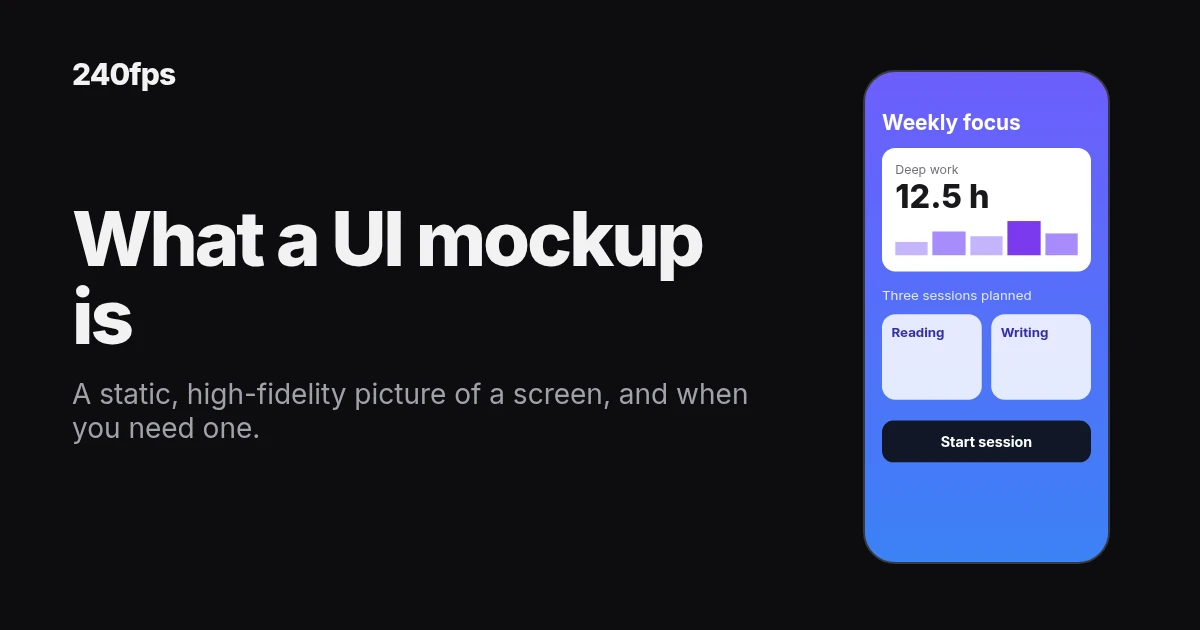
Someone on the team says "send me the mockup". The designer sends a grey box sketch. The founder wanted a polished screen for the investor deck. The developer wanted something they could click. Same word, three different files.
That mix-up is common because "mockup" means different things in different places. Our post on what a mockup is covers the general meaning. This one is about UI design: where a mockup sits between a wireframe and a prototype, what a good one contains, and how to turn the finished screen into a device shot.
A UI mockup is a picture of a finished screen
A UI mockup shows a screen the way it will look when it ships. The real layout. The real colours and type. Real headlines, real buttons, real photos. What it doesn't do is respond. Tap a button and nothing happens, because it's an image.
Designers describe this with the word fidelity: how closely a design matches the finished product. Low fidelity is rough and quick. High fidelity looks like the real thing. Nielsen Norman Group's article on high- and low-fidelity prototypes explains fidelity well, including why it's worth separating how something looks from how it behaves. A UI mockup is high fidelity in look and has no behaviour at all.
Wireframe vs mockup vs prototype: three jobs, not three drafts
It helps to see them side by side. The same screen can go through all three stages, and each one answers a different question.
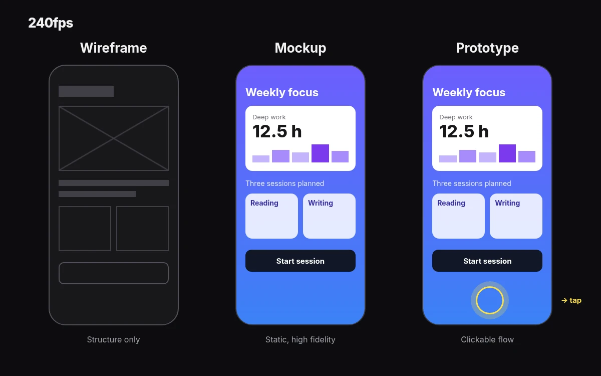
| Wireframe | UI mockup | Prototype | |
|---|---|---|---|
| Question it answers | What goes where? | What will it look like? | How will it work? |
| Fidelity | Low: boxes, lines, placeholder text | High: real colour, type, images and copy | Low to high, with interaction |
| Interactive? | No | No | Yes: taps, transitions, flows |
| Typical stage | Early, while structure is still moving | Middle, once structure is agreed | Later, to test flows or hand over behaviour |
The order isn't a rule. Some teams skip wireframes for a small change. Some prototype in rough boxes before anything is styled. But the questions stay the same, and asking the wrong file the wrong question is where time goes. Don't test a flow on a static mockup, and don't ask for colour feedback on a wireframe.
When a mockup is the right step
- Sign-off on the look. Stakeholders react to colour, type and imagery far more clearly when they can see them. A mockup gets "yes, that's it" or "no, too dark" before anyone writes code.
- Design handoff. Developers need exact spacing, colours and states. A finished mockup is the reference they build against.
- Marketing before the app ships. Store pages, launch posts and landing pages often need screens before the product is final. A mockup of the planned screen fills that gap, as long as it matches what you ship.
If the open question is "does this flow make sense?", you want a prototype instead. If it's "what should be on this screen at all?", go back to a wireframe.
What goes into a good UI mockup
A mockup is only useful if it tells the truth about the screen. Four habits help:
- Real content, not lorem ipsum. Real names are longer than you think. Real prices have decimals. Placeholder text hides the layout problems you'll meet later.
- Real states. Design the empty state, the error state and the loaded state, not just the happy one. A list with zero items and a list with 200 items are different screens.
- Platform conventions. An iPhone screen should respect the status bar, safe areas and standard controls. Apple's Human Interface Guidelines are the reference for Apple platforms.
- The right size. Design at the size of the device you're targeting, so text and touch targets read at their real scale.
From UI mockup to device mockup
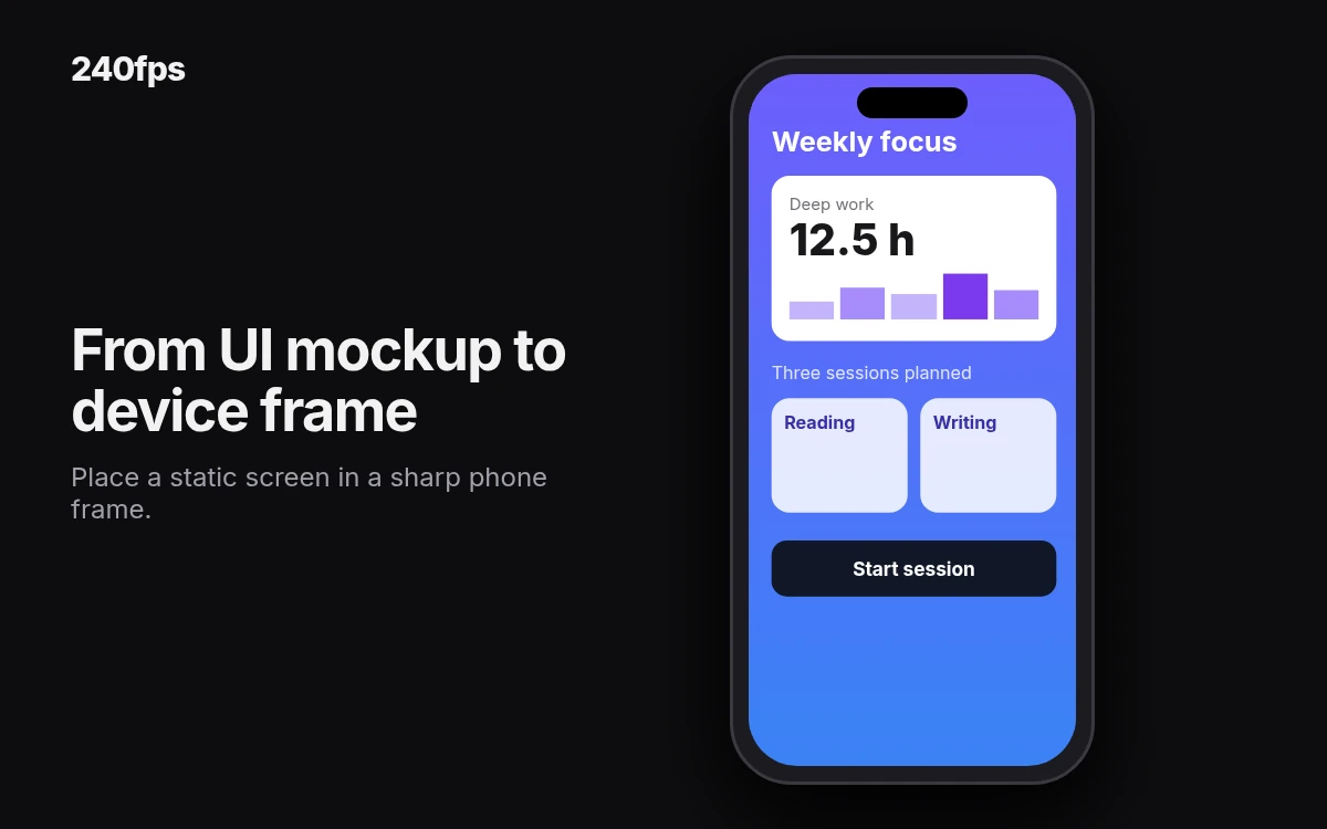
Once a screen is final, the next request is usually "can we see it on a phone?". That's a device mockup: your finished UI placed inside a frame of the device it runs on. It's what goes on a store page, a launch post or a pitch slide.
In 240fps, export your screen as an image and drop it into a frame. Start with an iPhone 17 mockup, a MacBook mockup or a browser mockup, or browse all device mockups and mockup templates. 240fps device frames are drawn in code, so they stay sharp at any size, and any frame can show a live website instead of a screenshot. The frames are made by 240fps, not supplied by Apple.
Got one screenshot and a few minutes? Screenshot to mockup is the quickest route. Shipping to the App Store? The App Store screenshot generator turns your screens into a store screenshot set.
Designing is free in the browser. Free exports are previews up to 1280 px with a small 240fps mark. Full exports are $7 a month or $39 once; see 240fps pricing. Comparing tools? Read 240fps vs Smartmockups.
Examples: one screen, from sketch to frame
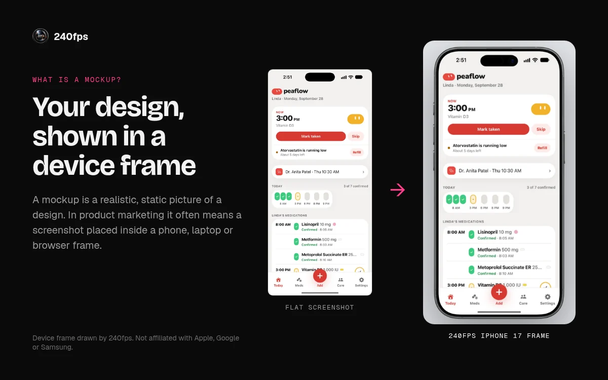
The two images above show the path this post describes. The first is one app screen at three fidelities: a grey wireframe, the full-colour UI mockup, and a prototype with a tap hint. The second is that finished screen placed in an iPhone frame, the way it would appear on a store page or in a launch post.
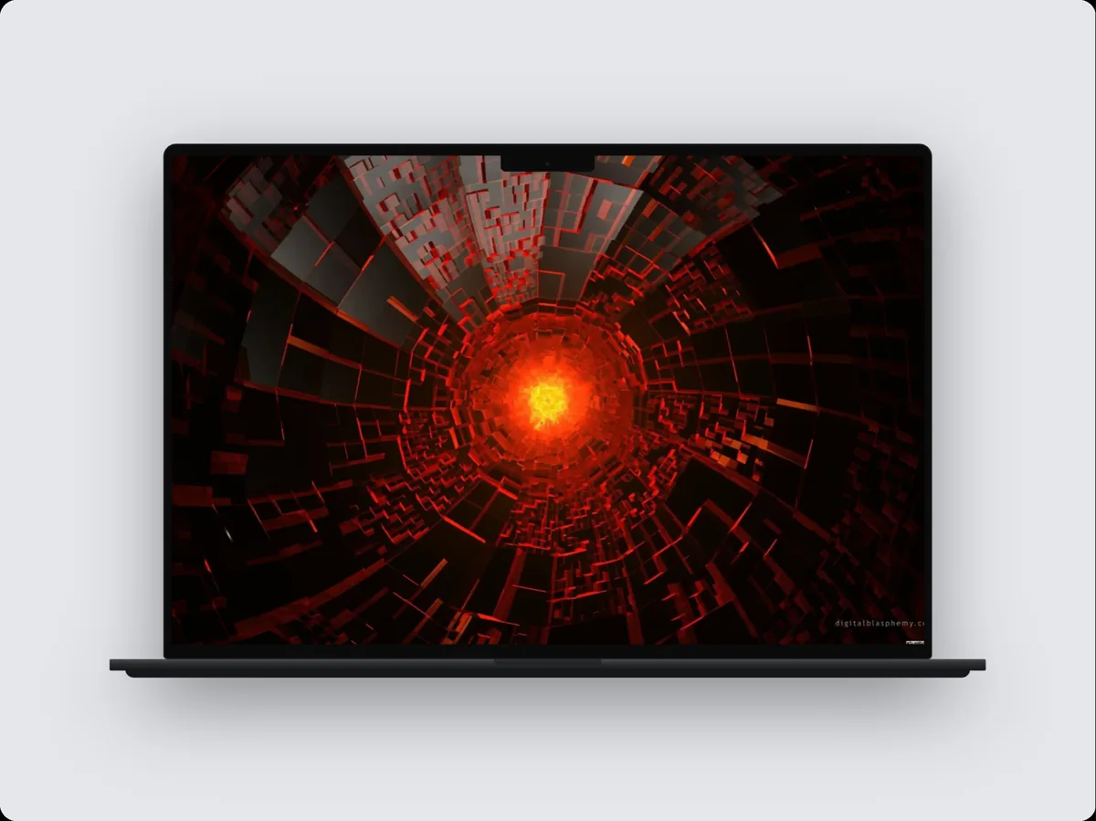
Here are two real 240fps renders, exported from the editor: a sample Today schedule screen in an iPhone frame, and a sample dashboard in a MacBook frame.
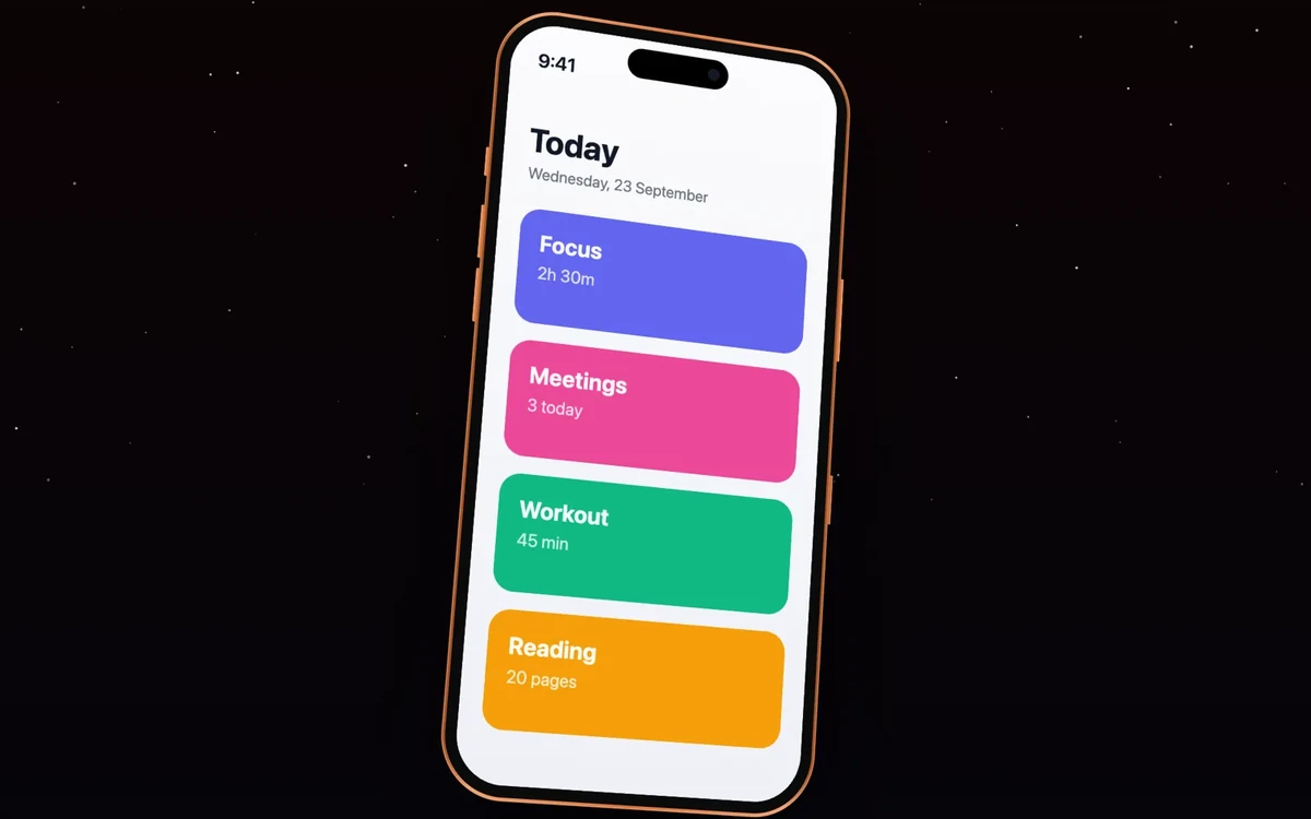
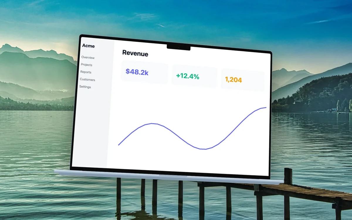
Try it with your own screen: pick a frame, drop in the export, and compare the preview with your mockup file. If something looks off in the frame, it was usually off in the mockup too.
UI mockup questions
What is a UI mockup?
A UI mockup is a static, high-fidelity picture of a screen. It shows the real layout, colour, type, images and copy the finished product will have, but nothing is clickable. Teams use it to agree on how a screen looks before it is built, and as the reference developers build against.
What's the difference between a wireframe and a mockup?
A wireframe shows structure only: boxes, lines and placeholder text that answer "what goes where?". A mockup adds the visual design: real colour, type, images and copy, answering "what will it look like?". Neither is interactive. Wireframes usually come first, while the structure is still changing and cheap to rework.
Is a mockup the same as a prototype?
No. A mockup is a static image of a screen. A prototype adds interaction, so you can tap through screens, see transitions and test a flow. A prototype can be rough or polished, but it always responds. Use a mockup to agree on the look and a prototype to check how it works.
Which comes first, wireframe or mockup?
Usually the wireframe. It settles structure while changes are cheap, then the mockup adds the visual design once the layout is agreed. The order isn't a rule: small changes often skip wireframes, and some teams prototype rough boxes first. Pick the file that answers the question you have right now.
Can I make a free device mockup of my UI?
Yes. In 240fps, designing is free in the browser: drop your screen into an iPhone, Mac or browser frame and export a free preview up to 1280 px with a small 240fps mark. Full-size exports with no mark are $7 a month or $39 once.