By Shaheer Malik · · 8 min read
How to Show Your Product in a Pitch Deck (2026)
Show one screen per slide, inside a device frame, with a one-line headline that says what the screen proves. Investors spend only a few minutes on a whole deck, so a slide has seconds to land. Crop to the part of the product that matters, make every word readable from the back of a room, and keep a 20–60 second video or a live demo for the meeting, not the emailed deck.
The product slide is where most decks get vague. Founders paste a full-page screenshot, shrink it to fit, and surround it with bullet points about features. The investor sees a grey rectangle and a wall of small text, and moves on.
This guide is about doing the opposite: one screen, one claim, readable at a glance. It uses two outside sources. One is DocSend's research on how investors read decks. The other is Y Combinator's design advice for Demo Day slides.
A disclosure first: I make 240fps, a mockup and product-video tool, and I use it for the examples below. You can do all of this in Keynote, Google Slides or Figma; I point out where.
How much time does a product slide get?
A few seconds. DocSend, the document-sharing company owned by Dropbox, studies how investors read the decks founders send them. Its pitch-deck research reports these findings:
- Investors spend less than three minutes reviewing a deck these days.
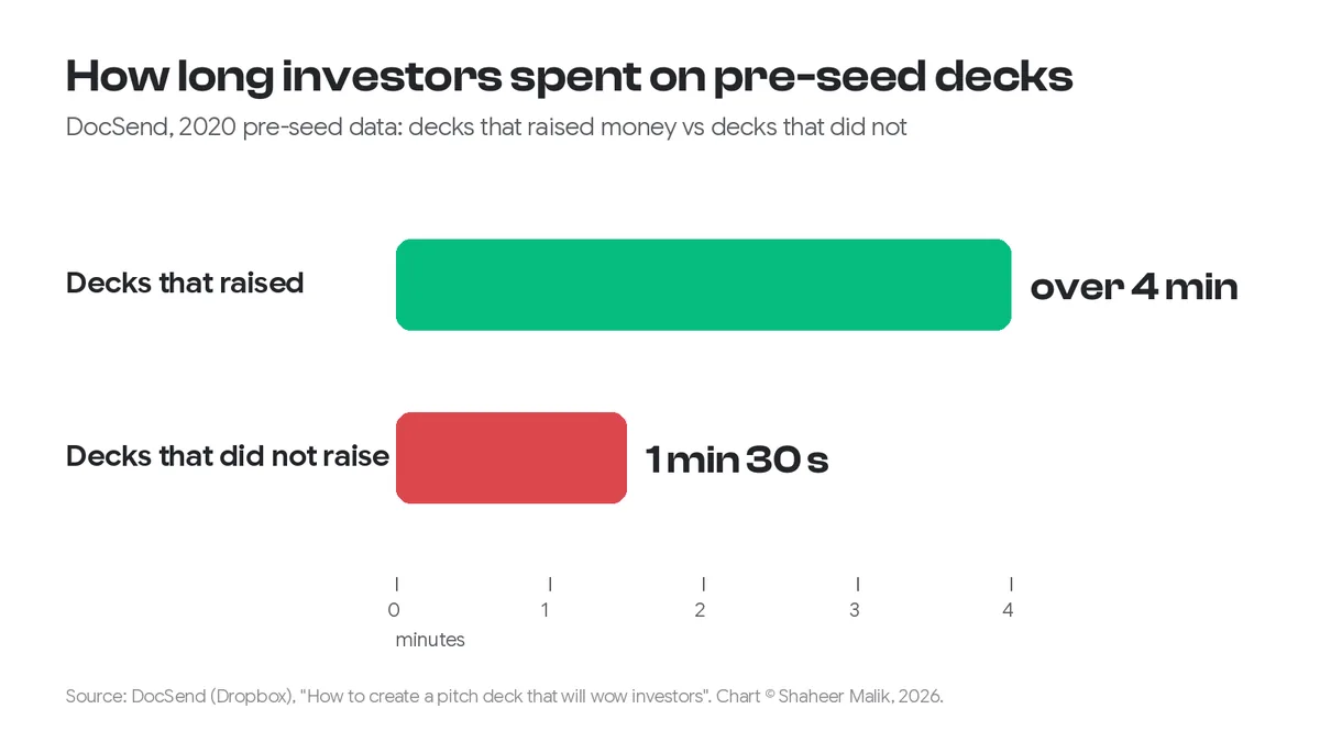
- In 2020, pre-seed decks that went on to raise money were read for over four minutes, against about a minute and a half for decks that didn't.
- Most decks are about 20 pages, with about 50 words per slide.
Divide three minutes by 20 slides and every slide gets around nine seconds. The product slide has to work in that time without you in the room to explain it. DocSend also found that investors paid more attention to product readiness in pre-seed decks: up 46% between 2019 and 2020. So the slide matters, and so does how fast it reads.

What should a product slide show?
One screen, and the one claim that screen proves. Pick the moment in your product that makes the pitch true. For a scheduling tool, that's the booked calendar, not the settings page. For an analytics product, it's the chart that answers a question, not the empty dashboard. Then write that claim as the slide's headline.
Y Combinator's partner Kevin Hale gives founders three tests in How to design a better pitch deck: "Slides should be legible, simple, and obvious." He walks through one slide where the team let the screenshot set the rules. The image dictated small, crowded text, and the fix was to make the words big and put them first. He also lists photos with no titles or captions among the distractions to cut.
In practice, that means:
- One idea per slide. If you need to show three features, make three slides. Don't build one collage.
- Crop hard. A full-page screenshot shrunk onto a slide makes every label unreadable. Show the part that proves the claim, at a size where its text can be read.
- Headline as the claim. "Our Product" says nothing. "Book a call in two clicks" says what the image proves.
- Big type, high contrast. Hale's rule is that the person in the back row with bad eyesight should be able to read it.
Before and after: the same product, two slides
Here's a slide I see often, made with a real screenshot of my own product, Forms:
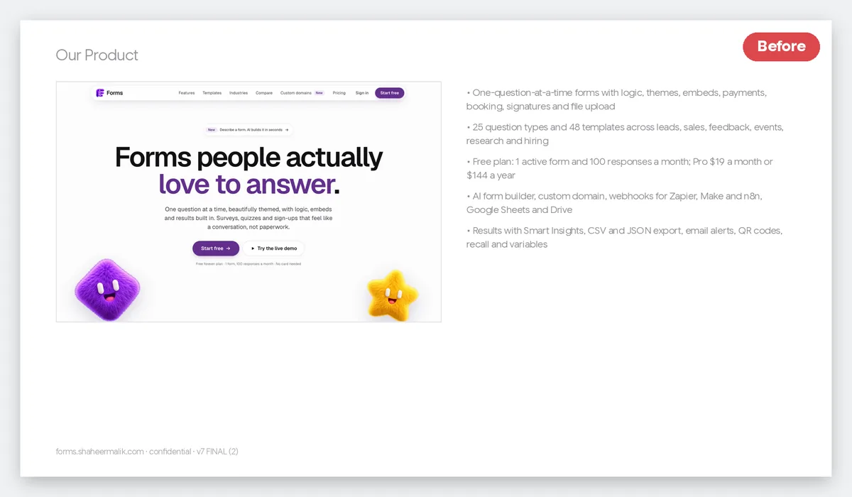
Every fact on that slide is true, and none of it lands. The title is generic. The screenshot is small, so its own headline is the only readable thing on it. The bullets compete with the image, and the footer adds clutter.
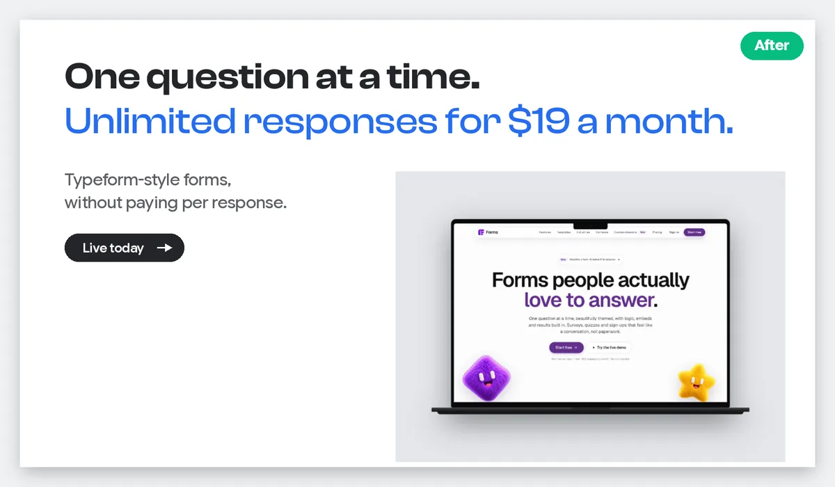
The "after" slide at the top of this post uses the same product. It has one claim in two lines, one supporting line, and the product inside a laptop frame, cropped so its headline is readable. An investor who reads only the headline still knows what the product does and why it's different. That's the job.
Raw screenshot, mockup, video or live demo?
Use a mockup in the emailed deck, and keep video and live demos for the meeting. Each format has a place:
| Format | Best for | Watch out for | Works in an emailed PDF? |
|---|---|---|---|
| Raw screenshot | Dense data where the detail is the point | Tiny text when shrunk; looks unfinished on its own | Yes |
| Device mockup (phone or laptop frame) | Showing a real, working product at a glance | Heavy 3D angles can make the screen harder to read | Yes |
| Short video or GIF (20–60 s) | A flow that only makes sense in motion | Many deck viewers don't autoplay video; needs a still fallback | Partly: link it, or add a poster frame |
| Live demo | The meeting itself | Wi-Fi, logins and bugs; rehearse with a recording as backup | No |
A device frame does quiet work: it tells the reader "this is a real product people use" before they read a word. Keep it straight-on or at a slight angle. If the screen is tilted so far that the text skews, you've traded clarity for decoration. My post on device mockup mistakes covers the common ones.
How do I make a device mockup for a slide?
Put a screenshot into a device frame, export a PNG at the slide's size, and place it on the slide. Here's how I made the "after" image:
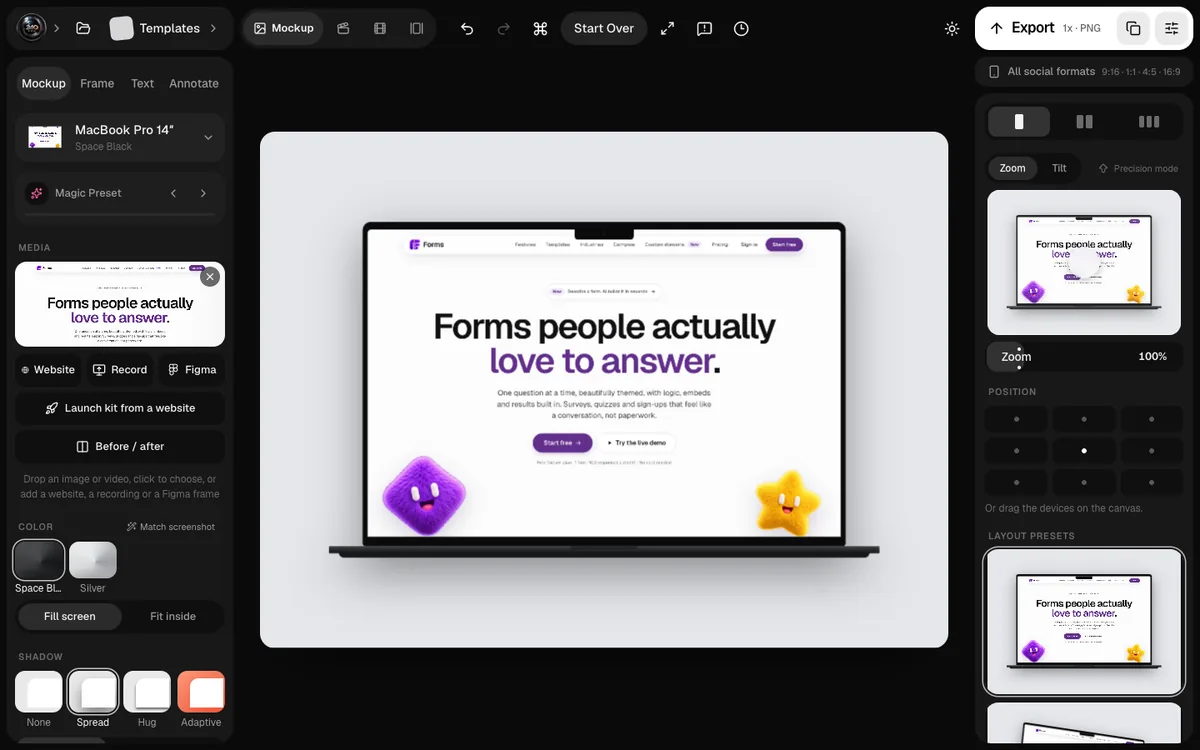
- Capture the screen at full resolution. On a Mac, press Shift-Command-4 and drag; on a website, use your browser's full-size screenshot. Crop to the part that proves your claim.
- Drop it into a frame. In 240fps, open the editor with a laptop (this link opens a MacBook Pro 14-inch) and drop the image in. You can also paste a live URL, and it renders the website inside the device. Figma users can import a frame directly; see Figma frame to device mockup.
- Match the slide. A 16:9 deck is 1920 × 1080 points; leave room on one side for the headline. A light, plain background keeps the slide calm.
- Export a PNG and place it in Keynote, Google Slides or PowerPoint. Designing is free in 240fps; exporting needs a plan ($39 once or $7 a month).
If you'd rather stay free, Keynote's own shapes can fake a simple browser frame: a rounded rectangle, three circles and your screenshot. It's less convincing, but it's legible, and legible matters more.
Should a pitch deck include a video?
In the meeting, yes; in the emailed deck, only as a link with a still image. A 20–60 second screen recording is the clearest way to show a flow, such as signing up, creating something, getting a result. But a PDF doesn't play video, and many investors read on their phone between meetings.
So put a strong still on the slide, with the claim as its headline, and link the video below it ("Watch the 40-second demo"). In the meeting, play it full screen. My guide to making a product demo video on a Mac covers recording one with automatic zooms on your clicks, so viewers can read what you're clicking.
A checklist before you send the deck
- [ ] Every product slide has one screen and one claim.
- [ ] The headline states the claim; there are no "Our Product" titles.
- [ ] All text, including text inside screenshots, is readable on a phone.
- [ ] Screens are cropped to the part that matters.
- [ ] Mockups are straight or slightly angled, never skewed past readability.
- [ ] Any video is linked from a still frame, not embedded.
- [ ] There's no fake data a sharp investor could question; use real or clearly labelled sample data.
FAQs
How many product slides should a pitch deck have?
One to three. Use one if a single screen proves the pitch; add more only if each one shows a different claim, such as the user's view, the result and the admin view. YC suggests Demo Day decks of only five to seven slides, so the product shouldn't take over the deck.
Should I use real data in product screenshots?
Use real data if you can show it, or clearly realistic sample data if you can't. Avoid placeholder text and obviously fake numbers; an investor who spots them starts doubting the rest of the deck.
What size should screenshots be for a 16:9 slide?
A 16:9 slide is 1920 × 1080 points. Export your mockup at least that size, or at 2x for sharp text on Retina screens, and let it take half to two-thirds of the slide.
Is a device mockup better than a plain screenshot?
For a pitch deck, usually yes. The frame signals a real product and gives the eye a clear edge. A plain screenshot is better when the detail is the point, like a dense data table that you then crop tightly.
Can I put a GIF in a pitch deck?
In Keynote and PowerPoint, yes, and it will play when you present. In a PDF it becomes a still image, so choose a first frame that works on its own.
Last updated: 4 October 2026. DocSend's figures are from its published research, and Y Combinator's advice from its startup library, both read on 4 October 2026.