By Shaheer Malik · · 7 min read
Your SaaS Hero Image Is Leaking Signups. Here's How to Fix It
A SaaS hero visual converts when it shows the product delivering its main outcome, not an abstract illustration or a crowded dashboard. Use one real screen, cropped or zoomed to the part that proves your headline, inside a browser or laptop frame, with nothing competing with your call to action. A short looping video of the product in use often does even better, as long as it stays light and starts with the payoff.
Your headline gets the credit, but your hero image does the work.
When someone lands on your SaaS homepage, their eyes go to the biggest, most visual thing on the screen. On most landing pages, that's the image or video beside the headline. It's the product's first handshake, and it happens before anyone reads your subheading.
Here's the problem: a lot of SaaS hero visuals don't show the product at all. Some show abstract 3D shapes. Some show a dashboard so dense it communicates nothing. Some show a stock photo of a smiling team.
All of them leave the visitor asking the same question: "But what does it actually do?"
In this guide, I'll show you what makes a hero visual convert, the options that tend to work best, how to design one without a design team, and how to test whether yours is pulling its weight.
Why the Hero Visual Matters So Much
Visitors don't read landing pages top to bottom. They scan: the biggest heading, the most prominent visual, the primary button. Then they decide whether to keep scrolling.
Your hero visual is one of those three anchors, and it's the only one that can show rather than tell. A headline says "Close your books in half the time." A hero visual shows the finished report, reconciled and ready, and makes the claim believable.
The job description of a hero visual
A good hero visual does four things:
- Shows what kind of product this is. Web app, mobile app, API, integration.
- Proves the headline. The outcome you promise, visibly delivered.
- Signals quality. A polished, real interface suggests a polished, real product.
- Stays out of the way. It supports the call to action rather than competing with it.
The Four Hero Visuals That Leak Signups
1. The abstract illustration
Floating 3D shapes, gradient blobs, people high-fiving next to a chart. They look modern and say nothing. Visitors can't tell what your product does or whether it's real.
2. The full dashboard
The opposite problem: the entire app, every panel and chart, shrunk to fit. At hero size, it's a wall of tiny rectangles. Nothing proves anything because nothing can be read.
3. The stock photo
A team smiling at a laptop suggests you have nothing specific to show. Worse, visitors have seen the same photo on other sites.
4. The fake UI
A heavily simplified "marketing version" of your interface that doesn't match the real product. It looks clean, until someone signs up and the real thing looks different. That gap costs you trust at the worst possible moment.
What Converts Instead
Real UI, cropped to the proof
Pick the one screen that proves your headline, then crop or zoom to the part of it that matters. If your headline is about reporting, show the report, not the navigation, settings and sidebar around it.
This is where a device or browser frame helps: it gives the crop context. A zoomed-in chart floating on its own looks like a chart; the same chart inside a laptop screen looks like your product.
A browser or laptop frame
For SaaS, a browser window mockup or a MacBook mockup tells visitors immediately that this is a web product they'll use at their desk. For products with a strong mobile side, a laptop with a phone beside it answers "does it work on my phone?" before anyone asks.
A short looping video
If your product's value is in the interaction (dragging, automating, generating), a short looping video can show it better than any still:
- 6 to 15 seconds, looping seamlessly.
- Starts on the payoff, or gets there within two seconds.
- No sound needed, no controls, no captions to read.
- Light: MP4 or WebM, not a heavy GIF.
Designing a Hero Visual Step by Step
Step 1: Start from your headline
Write down your headline, then ask: what would someone need to see to believe it? That's the content of your hero visual.
Step 2: Capture the real screen
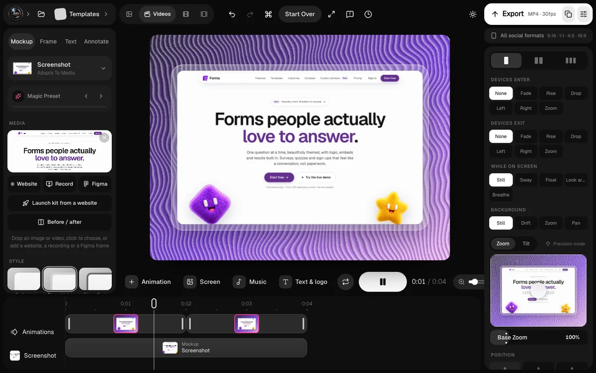
Use realistic data, the kind your customers actually have. Remove anything personal or unfinished. If your product is a website, capture it directly: a website mockup renders the live page at the device's own size, so you don't need to fake a screenshot.
Step 3: Frame and crop
Choose the frame (browser, laptop, laptop and phone), then zoom to the part that proves the headline. It's fine if some of the interface is cut off; that reads as "there's more" rather than "this is everything".
Step 4: Match your page
Pick a background that belongs to your page: your brand colour, a subtle gradient, or a transparent background so the device sits directly on your page. Avoid busy backgrounds behind a detailed UI.
Step 5: Add motion (optional)
If you're making a video, add one or two camera moves that point at the payoff: a slow push into the key number, a cursor clicking the main action. Loop it.
Layout Details That Matter
Size and position
Give the visual room. A hero image squeezed into a small column next to a long headline looks like an afterthought. On desktop, a roughly even split between text and visual, or a large visual below a centred headline, both work.
Mobile
On phones the visual usually stacks below the headline and button. Make sure it's still readable at that width; a laptop mockup that's legible on desktop may need a tighter crop on mobile.
Performance
The hero is usually the largest element on the page, so it often decides how fast the page feels. Size images to their display size, use modern formats like WebP, and don't lazy-load the hero.
How to Test Your Hero Visual
The three-second test
Show your homepage to someone who doesn't know the product for three seconds, then hide it. Ask what the product does. If their answer matches your headline, the hero is working.
Compare two versions
If you have enough traffic, test two hero visuals against each other, for example a still against a short video, or a full screen against a zoomed crop. Measure signups or clicks on the main button, not time on page.
Watch where people look
Session recordings and scroll maps show whether people stop at the hero or scroll straight past it. A hero that gets skipped isn't earning its space.
A Quick Before-and-After
| Before | After |
|---|---|
| Abstract illustration | The real product, in a laptop frame |
| Full dashboard, unreadable | One chart, zoomed, proving the headline |
| Stock photo of a team | The product delivering the promised outcome |
| Heavy autoplay GIF | Light looping MP4 that starts on the payoff |
FAQs
Should my SaaS hero be an image or a video?
Start with a strong still; it loads instantly and works everywhere. Add a short looping video if your product's value is in the interaction, and keep it light with a poster frame.
Should I show the whole dashboard?
Rarely. At hero size, a full dashboard is unreadable. Crop or zoom to the part that proves your headline, and let the frame suggest the rest.
Is it okay to use a simplified version of the UI?
Simplify by cropping and hiding clutter, not by redesigning. If the hero looks very different from the real product, new users notice, and trust drops right after signup.
What size should the hero image be?
Export it at the size it's displayed (and twice that for sharp screens), in WebP or a well-compressed PNG or JPEG. Oversized images slow down the most important part of the page.
Conclusion
Your hero visual is making the first pitch, whether you designed it to or not. Make it pitch the right thing: the real product, delivering the outcome your headline promises, in a frame that says what kind of product it is, with nothing competing for the click.
Fix that, and your headline finally has proof standing right beside it.
What does your current hero image show: the product, or something else?