By Shaheer Malik · · 7 min read
Google Play Screenshots: Sizes, Rules and a Layout That Converts
Google Play phone screenshots must be JPEG or 24-bit PNG files at 9:16 or 16:9, between 320 and 3,840 pixels on each side; 1080 × 1920 portrait is a safe choice. You need at least two (four or more at 1,080 pixels or larger is recommended) and can upload up to eight per device type, plus a required 1024 × 500 feature graphic. The screenshots that convert lead with the app's main benefit, use one headline per image, and keep a consistent style across the set.
On Google Play, your screenshots do the talking long before your description does.
People browsing the store see your icon, your name and your rating, then scroll through your screenshots. If the first two or three don't make them want the app, most will never read a word you wrote.
The good news: Google Play's rules are straightforward, and the principles that make screenshots persuasive are the same ones that work everywhere. Get the sizes right once, build a clear, consistent set, and your listing starts working for you.
In this guide, I'll cover the technical requirements, the feature graphic, how to structure your set, and the design choices that separate listings people skim from listings people install.
The Technical Requirements
Google Play's screenshot rules are simpler than Apple's per-device sizes. At the time of writing, for phone screenshots:
- Format: JPEG or 24-bit PNG, with no transparency (alpha).
- Size: each side between 320 and 3,840 pixels.
- Aspect ratio: 9:16 for portrait or 16:9 for landscape, and the long side can't be more than twice the short side.
- Number: at least two phone screenshots. Google recommends at least four at 1,080 pixels or more if you want your app to be eligible for its recommendations, and you can upload up to eight per device type.
Google updates its requirements from time to time, so check the Play Console help page on preview assets before you upload.
A safe size for phone screenshots
1080 × 1920 portrait (9:16) meets every rule, looks sharp on modern phones, and matches the size you'd use for Stories and Reels, so one design can do double duty. If your app is used in landscape, 1920 × 1080 works the same way.
Tablets
If your app supports tablets, upload tablet screenshots too: at least four, between 1,080 and 7,680 pixels per side, again at 9:16 or 16:9. Stretched phone screenshots look out of place on a tablet listing, and showing a real tablet layout tells people the app was designed for their device.
The Feature Graphic
The feature graphic is a 1024 × 500 image that Google Play can show in prominent places, such as at the top of your listing and in promotions. It's required, and it's easy to treat as an afterthought.
Make it count:
- Show your app's main screen or benefit, not just the logo.
- Keep text short and large; it's often shown small.
- Keep important content away from the edges and centre, where a play button can appear if you have a promo video.
How Many Screenshots, and in What Order
Use all eight slots only if each one earns its place. What matters most is the order.
Screenshot 1: The main benefit
The screen that shows why someone should install your app, with a headline that says it plainly. If people only see one screenshot, this is it.
Screenshots 2 and 3: The proof
The two features that best back up your main claim, one per screenshot, each with its own benefit-led headline.
Screenshots 4 to 8: Depth
Secondary features, integrations, customisation, trust signals like awards or press. Useful for people already interested, less critical for first impressions.
| Position | Purpose | Example headline |
|---|---|---|
| 1 | Main benefit | "Every expense, sorted automatically" |
| 2 | Key feature | "Scan a receipt in one tap" |
| 3 | Key feature | "See where your money goes" |
| 4 to 8 | Depth and trust | "Works with 5,000 banks", "Dark mode" |
Design That Converts
One message per screenshot
A screenshot with five features on it communicates none of them at store size. One headline, one screen, one idea.
Real screens, cleaned up
Show your actual interface with realistic data. Clean the status bar, remove debug overlays, and avoid empty states unless they're the point.
Device frames: optional but useful
A device frame makes a screenshot look like a product in use, and an Android frame such as a Pixel or Galaxy tells Android users the app belongs on their phone. Keep the frame the same across the whole set.
Readable headlines
Headlines should be readable when the screenshot is shown small in search results. Big type, few words, strong contrast with the background.
Consistency
The same background family, font, headline position and device across every screenshot makes the set read as one story and makes your app look established.
Google Play vs the App Store
If you publish on both stores, you can share most of the design work, but not the exact files.
| Google Play | App Store | |
|---|---|---|
| Sizes | Flexible within rules (320 to 3,840 px, max 2:1) | Fixed sizes per device class |
| Count | At least 2 (4+ recommended), up to 8 per device type | Up to 10 per device class |
| Transparency | Not allowed | Not allowed in practice; use solid backgrounds |
| Extra graphic | 1024 × 500 feature graphic (required) | None; app previews optional |
| Video | Optional promo video via a YouTube link; the first 30 seconds autoplay | App previews uploaded directly |
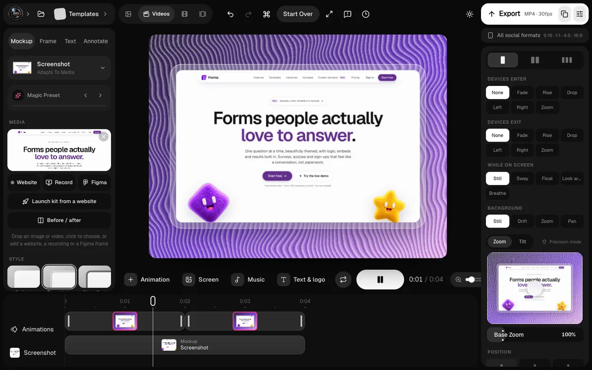
Design your set once at 9:16, then export Play Store and App Store sizes from the same project.
Localisation
If your app is available in several languages, localised screenshots, with translated headlines and, ideally, translated UI, help people in each market understand the app faster. Start with your biggest markets rather than translating everything at once.
Testing Your Screenshots
Google Play Console includes store listing experiments, which let you test different graphics and text against each other with real store traffic. Test one change at a time, such as a new first screenshot or a different headline, so you know what made the difference.
Common Mistakes
- Leading with a splash screen or logo. Your icon is already on the page.
- Tiny text. If you can't read it at thumbnail size, nobody else can.
- Mixed styles. Different backgrounds and fonts per screenshot look unfinished.
- Transparent PNGs. They're rejected; export with a solid background.
- Phone screenshots on tablet listings. Show your real tablet layout.
Custom Store Listings
Google Play lets you create custom store listings for specific countries or audiences, with their own screenshots and text. If different markets use your app for different reasons, a tailored first screenshot for each can make your listing far more relevant. Start with one custom listing for your second-biggest market and compare.
Designing the Feature Graphic
A few approaches that work well for the 1024 × 500 feature graphic:
- Device and headline: your key screen in a phone on the right, a short benefit headline on the left.
- Wide product scene: two or three phones in a row, showing a short flow.
- Brand-led: your app icon large, with a single line of text and a background in your brand colour.
Whichever you choose, keep it consistent with your screenshots, so the listing feels like one piece.
FAQs
What size should Google Play screenshots be?
Any size from 320 to 3,840 pixels per side, with the long side at most twice the short side, as JPEG or 24-bit PNG. 1080 × 1920 portrait is a safe, sharp choice for phones.
How many screenshots can I upload to Google Play?
At least two phone screenshots, and up to eight per device type; Google recommends four or more at 1,080 pixels or larger. Use as many as you have strong stories for, and put the best first.
Is the feature graphic required?
Yes. It's a 1024 × 500 image that Google Play can show prominently, so design it with the same care as your first screenshot.
Can I use the same screenshots as the App Store?
You can reuse the design and screens, but export each store's sizes separately, and use an Android frame (or none) for Google Play rather than an iPhone.
Conclusion
Google Play gives you flexible sizes and clear rules; what it can't give you is attention. Earn that with a first screenshot that shows your main benefit, two more that prove it, and a consistent style that makes your app look like it belongs on the front page.
Get the set right once, and it keeps working every day your app is in the store.
Which screen would you put first in your Google Play listing?