By Shaheer Malik · · 7 min read
App Store Screenshot Sizes (and How to Make Screenshots That Convert)
App Store screenshots are uploaded at fixed pixel sizes per device class, such as 1320 × 2868 for the 6.9″ iPhone, 1284 × 2778 for the 6.5″ iPhone, 2048 × 2732 for the 12.9″ and 13″ iPad, and 2880 × 1800 for the Mac. Apple asks for the largest iPhone size and scales it for smaller phones, so most apps design one iPhone set and one iPad set. You can upload up to ten per device class, and the first two or three matter most, because they're what people see in search results.
Your App Store screenshots are the only part of your listing most people ever look at.
In search results, they appear before your description, your reviews and your preview video. A person searching for an app sees your icon, your name, and your first few screenshots side by side with your competitors'. Then they decide.
Getting the sizes right is the easy part. Making those screenshots convince someone is the real job.
In this guide, I'll cover the sizes you need, how many screenshots to make, which ones people actually see, and how to design a set that turns browsing into downloads.
The Sizes
Screenshots are uploaded at exact pixel sizes for each device class. These are the ones you'll use most:
| Device class | Portrait | Landscape |
|---|---|---|
| iPhone 6.9″ | 1320 × 2868 | 2868 × 1320 |
| iPhone 6.5″ | 1284 × 2778 | 2778 × 1284 |
| iPhone 5.5″ | 1242 × 2208 | 2208 × 1242 |
| iPad 12.9″ and 13″ | 2048 × 2732 | 2732 × 2048 |
| Mac | 2880 × 1800 | (landscape only) |
Apple accepts some alternative sizes for several of these classes and revises the list as new devices arrive, so check the screenshot specifications in App Store Connect before you upload.
Which sizes you actually need
Apple asks for screenshots at the largest iPhone size and scales them down for smaller iPhones, so one well-made iPhone set usually covers every phone. If your app runs on iPad, it needs its own iPad set, since stretched iPhone screenshots look wrong on an iPad listing. Mac apps need Mac screenshots.
Format and count
- Format: PNG or JPEG.
- Count: up to ten screenshots per device class.
- Exact pixels: uploads at the wrong size are rejected, so design at the exact size rather than resizing afterwards.
Which Screenshots People Actually See
In search results, people see the first few screenshots side by side, and most never open the full listing. So the order matters more than the total.
The first screenshot is your ad
Show the outcome your app delivers, with a headline that says it plainly. If someone only sees one image, it has to sell the app on its own.
The second and third back it up
Use them for the features people care about most, one per screenshot.
The rest are for the interested
Secondary features, settings, integrations, awards. Useful for people who've opened the listing, less important for first impressions.
Designing a Set That Converts
One message per screenshot
A headline of five to eight words, big enough to read at thumbnail size. If you need a second line, the message is too complicated.
Real screens
Show the actual interface, cleaned up, not an illustration of it. Real screens build trust; people want to see what they'll actually get.
The device helps
An iPhone frame makes the screen look like a product in someone's hand, and it's instantly recognisable in a grid of flat screenshots. An iPhone 17 Pro Max mockup at the 6.9″ size is a safe starting point.
One visual system
The same device, background, type and colours across every screenshot, so the set reads as one story. A brand kit can apply your logo, colours and fonts in one click.
Readable text on the screen itself
If the interface text is tiny at thumbnail size, zoom in on the part that matters instead of showing the whole screen.
Panoramic Sets
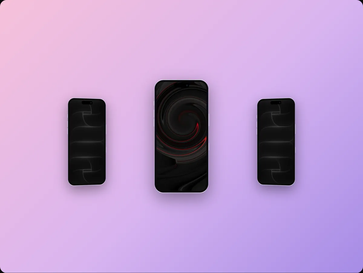
Some apps use one continuous background that flows across several screenshots, so the set looks like a single wide image when viewed side by side. It can look striking, but make sure each screenshot still works alone, because people often see them individually or cropped.
Headlines That Work
| Weak | Strong |
|---|---|
| "Dashboard" | "See your whole week at a glance" |
| "AI features" | "Draft replies in one tap" |
| "Sync" | "Your notes on every device" |
| "Customisable" | "Make it look the way you work" |
Write from the user's side: what they get, not what the feature is called.
Making Them in 240fps
- Open the editor at the App Store 6.9″ size with an iPhone 17 Pro Max.
- Paste your screenshot and add a headline in the Text tab.
- Pick a background and layout that suit your brand.
- Save the project, then duplicate it for each screenshot, changing only the screen and the headline, so the layout stays identical across the set.
- Export each one as a PNG at exactly the right size.
Don't Forget the App Preview
Alongside screenshots you can add app preview videos: short clips of the app in use, 15 to 30 seconds long, up to three per device class. A preview autoplays on the product page, so it's worth making one from the same screens once your screenshots are done. The App Store preview video guide walks through it.
Common Mistakes
- Wrong sizes, and rejected uploads the night before launch.
- Leading with onboarding or a sign-up screen.
- Tiny, dense headlines that nobody can read at thumbnail size.
- Mixed styles across the set.
- Outdated screens that don't match the current app.
Localising Your Screenshots
If your app is available in several countries, localised screenshots help people understand it faster. App Store Connect lets you upload different screenshots for each language.
Start with the markets that matter most to you:
- Translate the headlines first; that's where most of the message is.
- Localise the screens if your app is translated, so the interface matches the language of the listing.
- Check the layout: some languages run much longer than English, so leave room in the headline area.
A reusable template makes this manageable: duplicate the set, swap the text and screens, and export.
Testing Which Screenshots Work Best
Apple's product page optimisation lets you test different screenshots, app icons and preview videos against your original product page with real App Store traffic. Custom product pages let you create additional versions of your page for specific campaigns or audiences.
A few guidelines for testing:
- Change one thing at a time, such as the first screenshot or the headline style, so you know what made the difference.
- Test the first screenshot first, because it has the most influence on what people do.
- Let tests run long enough to reach a clear result before switching.
Keeping Screenshots Current
Outdated screenshots are a quiet problem: the app changes, the listing doesn't, and new users notice the mismatch after they download.
Build screenshot updates into your release routine:
- When a release changes a screen that appears in your listing, recapture it.
- Open the saved project, replace the screen, and re-export at the same sizes.
- Upload the new set with the release, or shortly after.
Keeping your screenshots as editable projects rather than flat images turns this into a few minutes per release instead of a redesign.
FAQs
What size are App Store screenshots?
For the 6.9″ iPhone, 1320 × 2868 portrait; for the 6.5″ iPhone, 1284 × 2778; for the 12.9″ and 13″ iPad, 2048 × 2732; for the Mac, 2880 × 1800. Check App Store Connect for the current list.
How many App Store screenshots should I upload?
Up to ten per device class are allowed. Use as many as you have strong stories for, and put your best two or three first.
Do I need screenshots for every iPhone size?
Usually not. Apple scales your largest iPhone screenshots for smaller phones. iPad and Mac apps need their own sets.
Should App Store screenshots use a device frame?
It's a common and effective choice, because it makes the screen look like a real product. Whatever you choose, use it consistently across the set.
Conclusion
App Store screenshots are the most-viewed part of your listing, and the first two or three do most of the selling. Get the sizes right, lead with your main benefit, give each screenshot one message, and keep the whole set in one consistent style.
That's how browsing turns into downloads.
What's the first screenshot in your current App Store listing, and does it show the payoff?