By Shaheer Malik · · 9 min read
Why Your Product Visuals Decide Your Launch (Not Your Feature List)
Product visuals decide a launch because people judge a product before they read about it: the first screenshot, video or hero image is what tells them what it does, who it's for and whether it's worth a click. Great launches treat visuals as the product's first impression, not decoration: one clear message per visual, real screens in context, motion that points at the payoff, and a consistent look across every channel.
You spent months on the product. The onboarding is smooth, the core feature is genuinely better than what's out there, and the changelog is a wall of thoughtful details.
Then launch day comes, and almost nobody gets far enough to notice any of it.
It's not because the product isn't good. It's because people decided whether to care before they ever touched it, based on a screenshot in a feed, a thumbnail in a store, or the first two seconds of a video.
That's the uncomfortable truth about launches: your product is judged by its visuals first and its features second. If the visuals don't earn the click, the features never get their chance.
In this guide, I'll show you why that happens, where launches quietly lose people, and a simple system for making visuals that do the selling for you.
The Feature List Trap
Most teams launch the way they build: feature by feature.
The launch post lists what's new. The screenshots show every screen, in order. The video tours the whole app, menu by menu, because everything in it was hard to build and all of it feels important.
The problem is that nobody arrives at your launch wanting a tour. They arrive mid-scroll, with half their attention, asking one question: "What is this, and is it for me?"
A feature list answers a different question, "What can it do?", which only matters after someone has already decided to care.
Why more features make it worse
Every extra thing you show dilutes the one thing that would have made someone stop. A screenshot with ten features on it communicates none of them at thumbnail size. A video that shows six screens in twenty seconds leaves the viewer remembering zero.
The more you try to say, the less anyone hears.
Why Visuals Win the First Few Seconds
Think about where people actually meet your product:
- A post in a feed, next to hundreds of others.
- A row of screenshots in App Store search results.
- A Product Hunt gallery.
- A hero image on your landing page, loaded after someone clicked an ad.
In every one of those places, the visual arrives before the words. The headline next to it gets a glance, the description gets skipped, and the decision, keep scrolling or look closer, happens almost instantly.
That's not a flaw in your audience. It's how people triage information when there's too much of it. A clear visual is simply the fastest way to understand something new.
What a visual communicates without a single word
A good launch visual answers three questions at a glance:
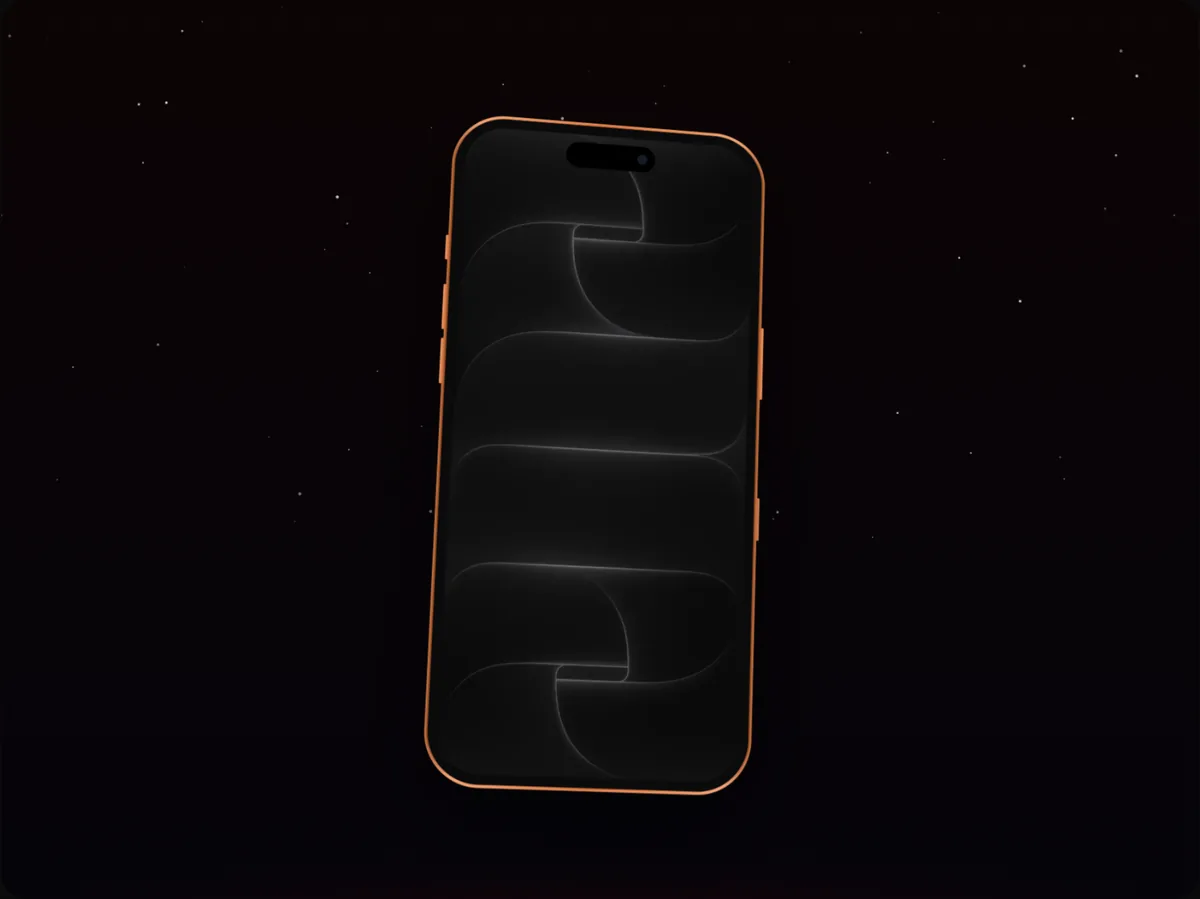
- What kind of product is this? An iPhone frame says mobile app. A MacBook says desktop or web. A browser window says website or SaaS.
- What does it do? The screen shows the outcome: the chart, the finished document, the booked appointment.
- Is it any good? Polish, clarity and consistency signal quality long before anyone reads a review.
A feature list can't do any of that in the time you have.
The Four Places Launches Lose People
When a launch underperforms, it's rarely one big mistake. It's attention leaking at a few predictable points.
1. The thumbnail doesn't read
Most visuals are designed full-size on a big monitor and then seen at a fraction of that size. Text that looked bold on your screen becomes a grey smudge in a feed. If your core message only works at full size, it doesn't work.
2. The first screen shows the setup, not the payoff
Sign-up forms, empty states and settings screens are the least persuasive screens in any product, and they're often the first ones teams show because they're first in the flow. Lead with the moment your product delivers.
3. There's motion, but it doesn't point anywhere
Movement grabs attention, which is exactly why random movement is a waste. A device that spins for no reason, or a camera that drifts across a screen without stopping on anything, spends the viewer's attention without telling them what to look at.
4. Every channel looks like a different company
A store listing in one style, a launch video in another, social posts in a third. Individually each is fine; together they make a small team look scattered. Consistency is a trust signal.
A Simple System for Launch Visuals That Work
You don't need a design team to get this right. You need a system you apply to every visual.
Step 1: Write the one sentence
Before you open any tool, write the sentence the visual has to communicate. "Split a bill in three taps." "Your inbox, summarised every morning." "Turn any website into a video."
If you can't write it, stop: the visual will try to say everything and land nothing.
Step 2: Pick the one screen that proves it
Find the single screen where that sentence becomes visible. For a budgeting app it's the chart, not the transaction list. For a writing tool, the finished draft, not the blank page.
Clean it up before you capture it:
- A full battery and a round time in the status bar.
- Realistic, tidy sample data, never "Test User 1".
- No notifications, no debug banners, no half-loaded images.
Step 3: Put it in context
A bare screenshot looks like a work in progress. The same screen in a device looks like a product someone uses.
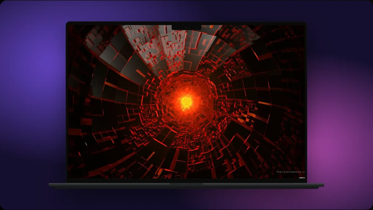
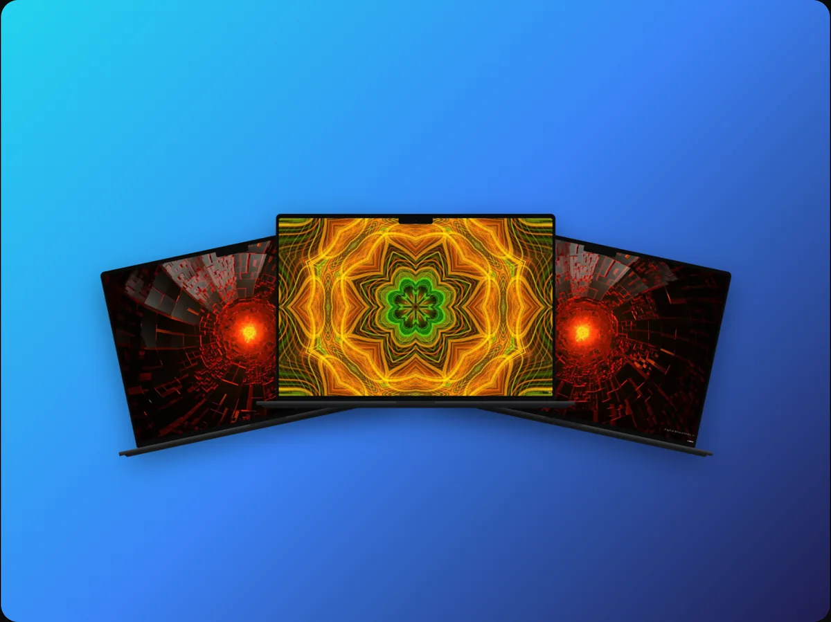
Match the frame to the audience: an iPhone mockup for a mobile app, a laptop or browser window for web and SaaS. If your product works everywhere, show two devices side by side rather than listing platforms.
Step 4: Add one line of text
The headline carries the message when the sound is off and the viewer is half-looking. Use your sentence, or a shorter version, set large enough to read at feed size. Two lines at most.
Step 5: Add motion that points
If the visual is a video, every movement should lead the eye somewhere:
- The device arriving, so the first second isn't static.
- A zoom into the detail that proves your sentence.
- A cursor or tap that shows the action happening.
- A pause at the end, so the last frame works as a thumbnail.
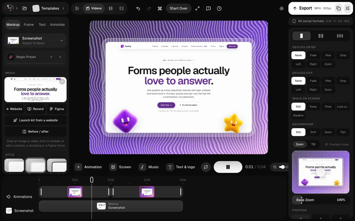
In 240fps these are camera moves on a timeline, and a cursor animation can show exactly where someone taps.
Step 6: Make the set, not the single
Once one visual works, turn it into a system: the same device, background, type and colours for the store screenshots, the launch video, the social posts and the landing page hero. That consistency is what makes a two-person team look like a company.
What Great Launch Visuals Have in Common
Launch visuals that land tend to share a handful of traits.
| Trait | What it looks like | Why it works |
|---|---|---|
| One idea | One screen, one headline | Understood in a glance |
| Real UI | The actual interface, tidied | Signals a real, working product |
| Context | A device or browser frame | Instantly says what kind of product it is |
| Directed motion | Zooms and taps on the payoff | Tells the eye where to look |
| Consistency | Same style across channels | Builds trust and recognition |
None of these need a big budget. They need decisions.
How to Measure Whether Your Visuals Work
You can't improve what you don't look at. A few signals worth tracking:
Click-through where the visual appears
In stores, that's product page views from search. On social, it's clicks and profile visits, not just likes. On your landing page, it's how many people scroll past the hero or click the main button.
Watch-through on video
If people drop off in the first two or three seconds, the opening isn't earning attention. If they watch to the end but don't click, the payoff or the call to action isn't clear.
What people say it does
Ask a few people who don't know your product to describe it after seeing your main visual for a few seconds. If their description matches your one sentence, the visual works.
Your 7-Day Launch Visual Plan
If you're launching soon, here's a simple plan.
- Day 1: Write your one sentence and pick the one screen that proves it.
- Day 2: Capture clean screens: status bar, sample data, no clutter.
- Day 3: Make the hero visual: device, background, headline. Test it at thumbnail size.
- Day 4: Turn it into a 10–20 second video with directed motion.
- Day 5: Make the store screenshot set in the same style.
- Day 6: Cut versions for each channel: square, vertical, wide.
- Day 7: Show all of it to three people who've never seen the product, and fix what they misunderstand.
FAQs
Do I need a designer to make launch visuals?
No. You need clear decisions (one message, one screen, one style) and a tool that handles the craft: device frames, backgrounds, typography and motion. Most of what makes launch visuals look professional is restraint, not skill.
Should my launch visual be a video or a still image?
Both. Lead with video where motion is autoplayed (social feeds, store previews, Product Hunt), and use a strong still where it isn't (link previews, thumbnails, the first store screenshot). Make the still first; the video is the still in motion.
How many screenshots should I show?
Fewer than you think. For a launch post, one great visual beats five average ones. For a store listing, use the full set, but put the one that carries your main message first.
What's the most common mistake?
Leading with the setup instead of the payoff: sign-up screens, empty states and settings. Show the moment your product delivers value first.
Conclusion
Your product will be judged by its visuals long before it's judged by its features. That isn't unfair; it's how people cope with too much to look at.
The good news is that visuals are the most fixable part of a launch. Decide on one message, prove it with one real screen, put that screen in context, point at the payoff, and keep the look consistent everywhere you show up.
Do that, and your features finally get the audience they deserve.
What's the one sentence your next launch visual needs to say?