By Shaheer Malik · · 7 min read
How to Make a Product Hunt Gallery That Gets Upvotes (Not Just Views)
A Product Hunt gallery that earns upvotes leads with one image or short video that shows your product's main outcome, then uses the next slots to show the two or three features that back it up, each with a single headline. Use real screens in device or browser frames, keep one consistent style, and make sure every image makes sense at a glance, because most visitors skim the gallery instead of reading the description.
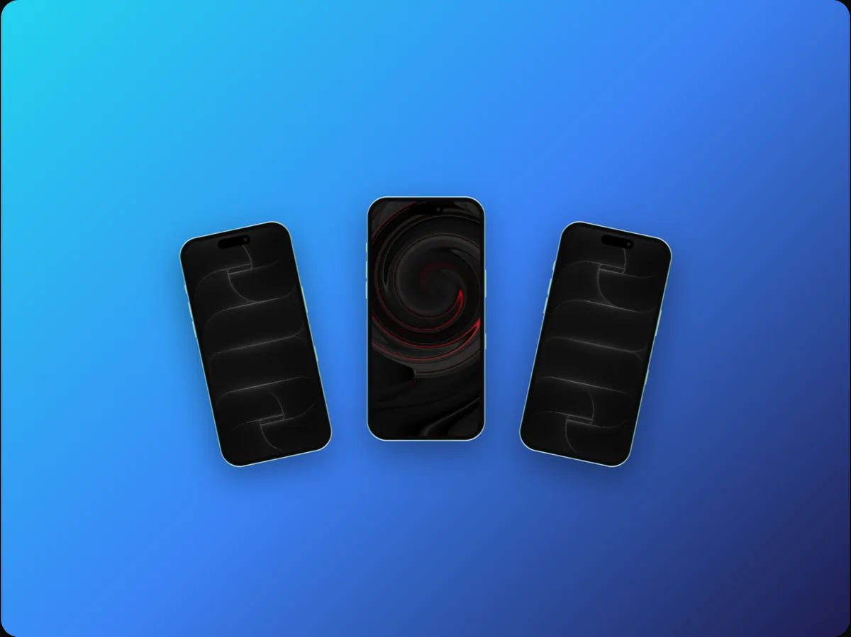
Launch day on Product Hunt is a strange kind of attention.
Thousands of people visit, but almost none of them read. They land on your page, glance at the tagline, flick through the gallery, and decide in a few seconds whether to upvote, comment, click through, or move on to the next launch.
That makes your gallery the most important real estate you have. It's not decoration under the description; for most visitors, it is the description.
In this guide, I'll walk through what to put in each gallery slot, the sizes and formats to use, how to use video without wasting it, and the mistakes that quietly cost launches their momentum.
Why the Gallery Matters More Than the Description
Think about how you browse Product Hunt yourself. You scan the list, click something with an interesting tagline, and then your eyes go straight to the big visual at the top.
If that visual shows you what the product does, you keep going. If it shows a logo on a gradient, or a dense screenshot you can't read, you're back on the list before you've read a word of the description.
Your gallery is your pitch. The description is for the people your gallery already convinced.
The Gallery Slot Plan
Treat the gallery as a short story told in images. Here's a structure that works for most products.
Slot 1: The outcome
The first slot is your hero. It should show the single most impressive outcome of your product, in context, with a short headline.
- A mobile app: the key screen in an iPhone frame.
- A web app or SaaS: the main view in a browser or laptop frame.
- A developer tool: the result, not the terminal command that produced it.
If you use a video here, its first frame still has to work as a still image, because that's what people see before it plays.
Slots 2 to 4: The proof
Each of the next slots shows one feature that backs up your main claim. One feature per image, one headline per feature.
Good headlines describe the benefit, not the button:
- Not "Smart filters" but "Find any invoice in two clicks."
- Not "Integrations" but "Works with the tools you already use."
Slot 5: Who it's for, or how it works
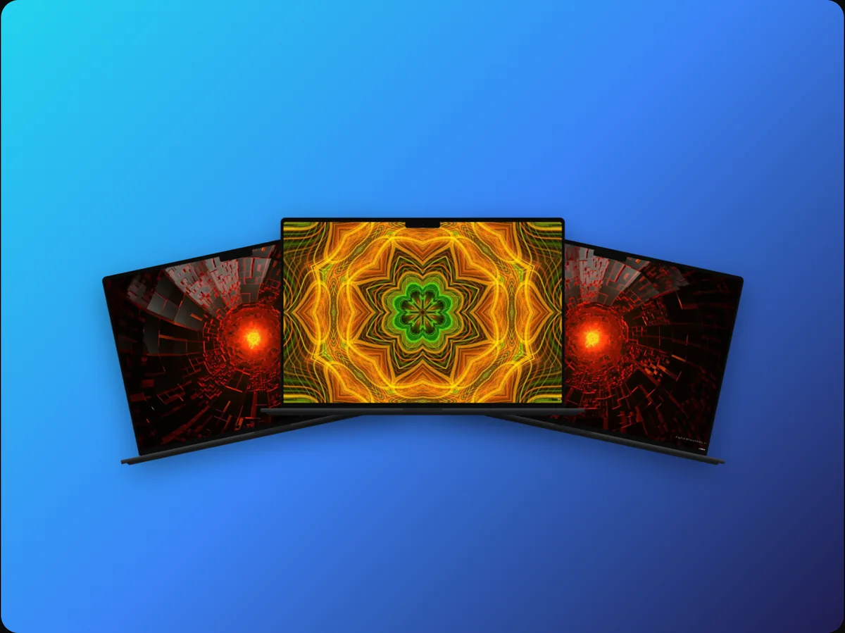
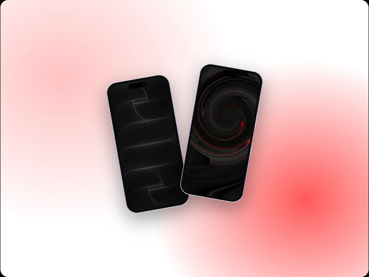
Use a late slot to answer the question that's left: who is this for, or how does it fit into someone's day? A multi-device shot, a before-and-after, or a three-step flow works well here.
The last slot: The call to action
End with something that tells people what to do next: try it free, the launch discount, or where to download. Keep it simple, since by now they've seen enough to decide.
Sizes and Formats
Product Hunt recommends gallery images at 1270 × 760 pixels, a wide shape of roughly 5:3, with each file under 3 MB, and a square 240 × 240 thumbnail. Your gallery needs at least two images before it shows on the post. Check their current guidelines before launch day, since recommendations change.
A few practical rules:
- Design at the recommended size, not a random screenshot size, so nothing is cropped.
- Keep important content, especially text, away from the edges.
- Export PNG for crisp UI, or JPEG for photographic backgrounds to keep files small.
- Keep text large; the gallery is often viewed on phones.
Using Video Without Wasting It
A short video in the gallery can outperform any still, but only if it respects how people watch: muted, briefly, and while deciding whether to stay.
The first three seconds
Show the product working immediately. No logo animation, no title card, no slow fade from black. The first frame should already be a good still.
Keep it short
Twenty to forty seconds is plenty for a gallery video. You're not making a tutorial; you're making someone curious enough to click.
Point at the payoff
Use camera moves to lead the eye to what matters: zoom into the result, follow a tap with an animated cursor, highlight the key number with a callout. Random motion wastes the attention it grabs.
Captions over voiceover
Most people browse with the sound off. Put the message in on-screen text; treat music and voice as a bonus.
Common Gallery Mistakes
Most gallery problems fall into a handful of patterns:
| Mistake | Why it hurts | Fix |
|---|---|---|
| Logo as the first image | Says nothing about the product | Lead with the outcome |
| Dense full screenshots | Unreadable at gallery size | Zoom into the part that matters |
| Different styles per slot | Looks unfinished | One device, background and type style |
| Feature names as headlines | Doesn't say why it matters | Write the benefit |
| Setup screens | Least persuasive part of the product | Show the payoff |
The "everything slot"
It's tempting to cram your whole product into one image: six screens in a collage with arrows. At gallery size, that becomes visual noise. Split it into separate slots, one idea each.
How to Make Your Product Look Established
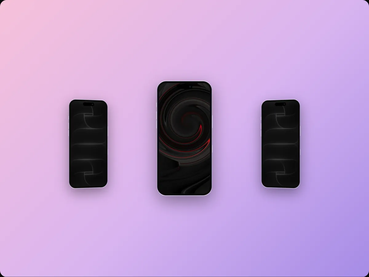
New products compete against products with design teams. The quickest way to close that gap is consistency, not complexity.
- One device family. Don't mix a realistic phone in one slot and a flat outline in the next.
- One background system. A single colour or gradient family from your brand, reused everywhere.
- One type style. The same font, weight and size for every headline.
- Real data. Believable names, numbers and content, never lorem ipsum.
A brand kit makes this painless: set your logo, colours and fonts once and apply them to every slot.
Beyond the Gallery
Your gallery visuals shouldn't stop working after launch day. The same set becomes:
- Your launch tweet and LinkedIn post images.
- The hero visual on your landing page.
- Your App Store or Play Store screenshots, resized.
- A website video for your social profiles.
Make the set once and resize it for each channel, rather than starting from scratch every time.
A Pre-Launch Checklist
Before you schedule the launch, check each slot against this list:
- Does the first image show the outcome, not the logo?
- Can you understand every image in three seconds at phone size?
- Is there one idea and one headline per slot?
- Do all slots share the same device, background and type?
- Does the video show the product in the first three seconds?
- Is the last slot a clear next step?
FAQs
What size should Product Hunt gallery images be?
Product Hunt recommends 1270 × 760 pixels for gallery images, each under 3 MB, plus a 240 × 240 thumbnail. Check their current guidelines before you launch, and keep important content away from the edges.
Should I put a video in my Product Hunt gallery?
Yes, if it shows the product working within the first three seconds and makes sense without sound. A slow intro or a logo animation wastes the attention a video earns.
How many gallery images should I use?
Enough to tell the story and no more: usually a hero, two to four features, and a closing call to action. Every slot should earn its place.
Can I reuse my App Store screenshots?
Reuse the style and the screens, but resize the layout. Store screenshots are tall; Product Hunt gallery images are wide, so the composition needs to change.
Conclusion
On launch day, people decide with their eyes. Your gallery is where that decision happens, so treat it like the pitch it is: lead with the outcome, give each feature its own slot and headline, use video that shows the product working immediately, and keep one consistent style throughout.
Get that right, and your description only has to confirm what your gallery already sold.
What's the one image you'd put in your first gallery slot?