By Shaheer Malik · · 7 min read
The Design Principles Behind Mockups That Look Expensive
Mockups look expensive because of restraint, not effects: one clear subject, generous space around it, a quiet background with a single colour story, soft realistic light and shadow, believable device proportions and angles, and consistent choices across a set. Premium mockups remove everything that doesn't serve the screen, and use depth, light and motion to lead the eye to it.
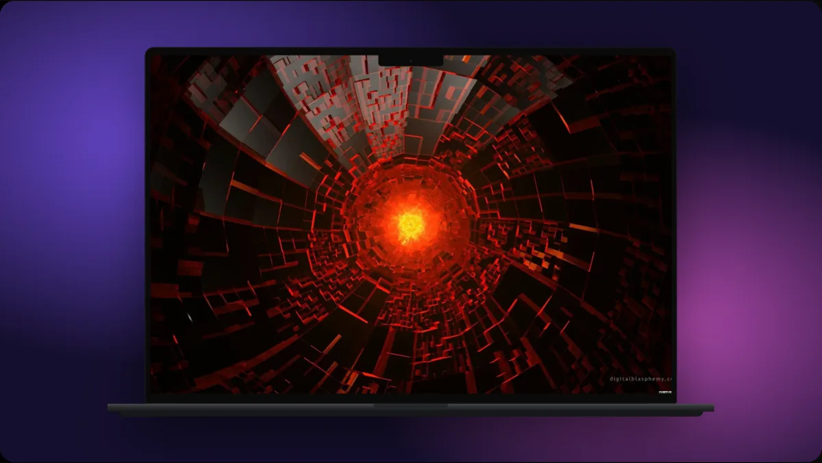
Some mockups look like they were made by a well-funded design team. Others, using the same device and the same screenshot, look like a quick side project.
The difference is rarely the tool or the device model. It's a handful of design decisions about space, light, colour, composition and restraint, the same principles that make a product photo or a magazine layout feel premium.
In this guide, I'll break those principles down into practical choices you can apply to any mockup, whether it's a single App Store screenshot or a launch video.
Principle 1: One Clear Subject
Expensive-looking visuals know what they're about. The eye lands on one thing (your screen) and stays there.
- One device, or a deliberate group that reads as one unit.
- One screen that carries one idea.
- One headline, if any.
Every extra element competes for attention. Before adding a badge, a second device or a decorative shape, ask whether it helps the viewer understand the screen. If not, leave it out.
Principle 2: Space Is the Luxury
Cheap-looking mockups fill the frame. Premium ones leave room.
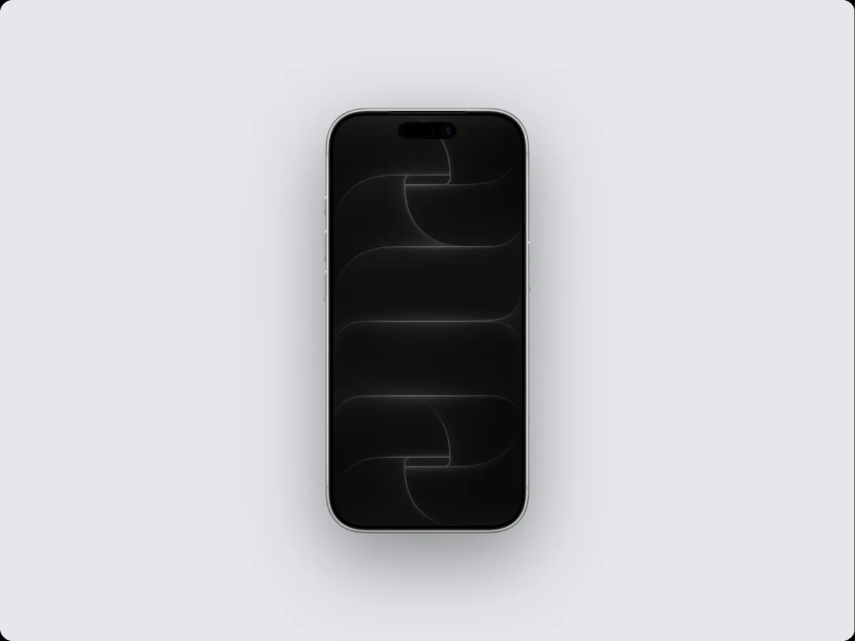
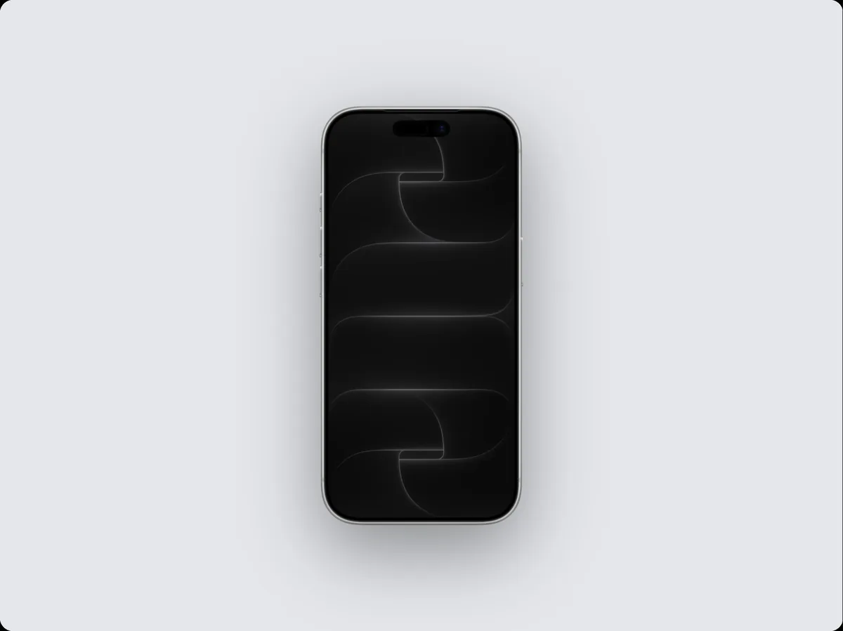
- Let the device take up a clear portion of the frame, often around half to two-thirds, with generous margins.
- Keep text away from the edges.
- Leave breathing room between the headline and the device.
Space signals confidence: the product doesn't need to shout. It also makes the visual survive cropping, which matters in feeds and stores.
Principle 3: One Colour Story
Premium visuals use colour deliberately, usually one of these approaches:
- Monochrome: a background in a tint or shade of your brand colour, with a matching headline.
- Neutral + accent: a soft neutral background (warm grey, off-white, deep charcoal) with one accent colour from the product.
- Colour from the screen: a background picked from the dominant colour in your UI, so the device and background feel related.
Avoid mixing several unrelated gradients across one set. When every visual shares a colour story, the whole brand feels intentional.
| Approach | Looks | Best for |
|---|---|---|
| Monochrome brand tint | Bold, confident | Launch posts, social |
| Neutral + one accent | Calm, premium | Landing pages, stores |
| Colour from the screen | Harmonious, natural | Hero images, case studies |
Principle 4: Soft, Believable Light
Light is what makes a flat device look like an object.
- Soft shadows beneath or behind the device, with a gentle falloff, not a hard dark outline.
- One light direction across the whole set. Shadows falling different ways in different screenshots feel subtly wrong.
- Subtle highlights on the device edge, not glare that covers the screen.
A little grain or noise over a gradient background can add richness and stops gradients from banding, but keep it barely visible.
Principle 5: Believable Devices and Angles
- Current devices. A current phone signals a current product.
- Real proportions. If you show a phone next to a laptop, keep their relative sizes believable.
- Gentle angles. A slight tilt adds depth; an extreme angle makes the screen unreadable and looks like an effect for its own sake.
- Finishes that suit the background. A silver device on a light background, space black on dark, or a colourful finish to echo your brand colour.
Principle 6: Typography With Restraint
If your mockup has text:
- One typeface, ideally your brand's, in one or two weights.
- Short headlines: five to eight words.
- Large, but not shouting: readable at the size people will see it, with comfortable spacing.
- Aligned with the composition: centred above a centred device, or aligned to one edge in an asymmetric layout.
Text effects (outlines, heavy shadows, gradients on letters) almost always cheapen a mockup. A clean headline on a quiet background looks more expensive.
Principle 7: Motion With Purpose
In video, premium mockups move slowly and deliberately:
- Ease-in and ease-out on every move; nothing starts or stops abruptly.
- Fewer, longer moves rather than many quick ones.
- Every move points somewhere: toward the detail that matters, then back to rest.
- Loops that don't jump, if the video repeats.
Frantic motion reads as cheap; calm motion reads as confident.
Principle 8: Consistency Across the Set
A single beautiful mockup is nice. A consistent set is what makes a brand look established.
Decide once, then reuse:
- Device model and finish.
- Background colour story.
- Headline font, size and position.
- Light direction and shadow style.
- Camera angle and zoom level.
A saved template or a brand kit that applies your logo, colours and fonts in one click turns these decisions into defaults.
Putting It Together: A Before and After
| Cheap-looking | Expensive-looking |
|---|---|
| Three devices, two badges, a long headline | One device, one short headline |
| Loud multicoloured gradient | Soft tint of the brand colour |
| Hard, dark drop shadow | Soft, diffused shadow |
| Extreme 3D angle | Gentle tilt or straight-on |
| Different style per screenshot | One consistent system |
| Fast, jittery motion | Slow, eased, purposeful moves |
A Five-Minute Upgrade Checklist
- Remove one element that isn't helping.
- Increase the space around the device.
- Replace the background with a tint of your brand colour or a soft neutral.
- Soften the shadow and make its direction consistent.
- Shorten the headline and make it one weight, one size.
Try it on your current App Store screenshots or hero image; the difference is usually immediate.
Principle 9: Sweat the Small Details
Premium visuals survive close inspection. The small things people only notice when they're wrong:
- The status bar: full battery, full signal, a round time.
- The data: believable names, prices and content, never placeholders.
- The edges: the screen sits perfectly inside the device, with no gaps or misaligned corners.
- The resolution: sharp screens exported at the size they'll be shown, not upscaled.
- The alignment: headline, device and margins lined up to a clear structure.
None of these is visible when done right, which is the point. Each one done wrong makes the whole visual look less careful.
Examples by Product Type
The principles are the same everywhere, but they play out differently depending on what you're showing.
Mobile apps
A single phone, centred or slightly off-centre, with generous space above for a short headline. A tint of the app's accent colour as the background. A soft shadow beneath the phone. For a set, the same position and headline style on every screenshot.
SaaS and web apps
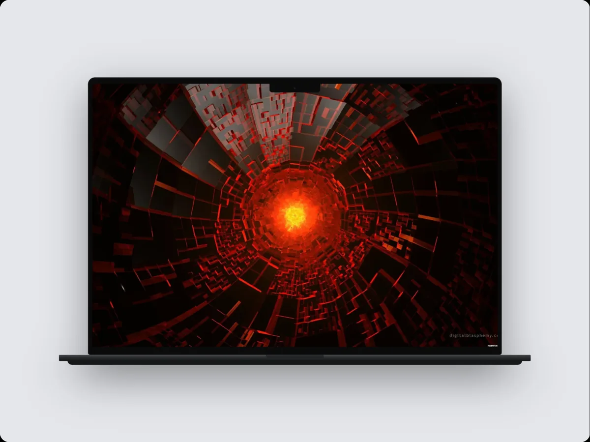
A laptop or browser window, often cropped so part of the device runs off the edge. That suggests scale and lets the interface be larger. A neutral background with one accent from the product. Zoom into the part of the interface that carries the message.
Developer tools
A browser window or a code-focused frame on a dark, neutral background. Monospace details, restrained colour, and plenty of space. Avoid consumer-style gradients that clash with a technical audience.
Consumer hardware companions (watch, fitness, smart home)
A watch or phone close-up with a soft, warm background. Realistic scale matters here: people know how big a watch is, and anything off looks fake.
FAQs
What makes a mockup look professional?
Restraint and consistency: one clear subject, generous space, a single colour story, soft realistic light, believable devices, and the same choices repeated across every visual.
Should mockups use gradients?
They can, if they're soft and use neighbouring colours. Loud, multi-colour gradients tend to compete with the screen. A subtle grain over a gradient helps it look richer.
Are 3D effects worth it?
Gentle depth (a slight tilt, a soft shadow) helps. Extreme angles and heavy effects usually make the screen harder to read and the visual feel less premium.
How do I keep a set of mockups consistent?
Decide the device, background, type, light and angle once, save them as a template or brand kit, and start every new visual from it.
Conclusion
Expensive-looking mockups aren't about more effects; they're about fewer, better decisions. Give one subject room to breathe, choose one colour story, light it softly, keep the devices believable, and repeat those choices everywhere.
Do that, and your product looks as considered as it actually is.
Which of these principles would make the biggest difference to your current mockups?