By Shaheer Malik · · 7 min read
15 Device Mockup Mistakes That Make Great Products Look Cheap
The mockup mistakes that make products look cheap are mostly small: messy status bars, fake or empty data, the wrong device for the audience, busy backgrounds, unreadable text, mixed styles across a set, heavy effects, and screens that don't match the frame. Fix them by capturing clean, realistic screens, choosing one device and one background system, keeping text large and minimal, and checking every visual at the size people will actually see it.
A device mockup is supposed to make your product look real, finished and trustworthy.
But a surprising number of mockups do the opposite. A low battery icon in the corner. "Lorem ipsum" in a list. A phone floating on a background so busy you can't find the screen. Each one is small; together they whisper "side project" to everyone who sees them.
The frustrating part is that most of these mistakes take seconds to fix once you know to look for them.
Here are fifteen of the most common, grouped by where they happen: the screen, the scene, the text, and the set.
Mistakes on the Screen
The screen is what people actually look at. Get it wrong and nothing around it can save the mockup.
1. A messy status bar
A 12% battery, one bar of signal, a time like 3:47 and a row of notification icons. It's the first thing a careful viewer notices. Fix: set a clean status bar before you capture (full battery, full signal, a round time), or crop above it.
2. Fake or placeholder data
"Lorem ipsum", "Test User", "$0.00", and "asdfgh" tell people the product isn't used by anyone. Fix: fill the app with realistic, attractive sample data: believable names, sensible numbers, real-looking content.
3. Empty states
An empty inbox or a blank dashboard shows a product before it's useful. Fix: show the product mid-use, with content, unless the empty state itself is the point.
4. Personal or sensitive information
Real customer names, emails, API keys, internal URLs. It's both a privacy problem and a trust problem. Fix: use sample accounts, or blur the details before you export.
5. A screenshot that doesn't match the frame
A desktop screenshot squeezed into a phone, or a phone screenshot stretched into a tablet. It looks wrong even to people who can't say why. Fix: capture at the device's own screen size. For websites, render the page at the device's viewport so the phone gets the real mobile layout.
Mistakes in the Scene
6. The wrong device for the audience
An iPhone mockup for an Android-only app, or a phone for a desktop-only tool. The frame is a message about who the product is for. Fix: match the device to where your users actually use the product. If it works everywhere, show two devices side by side.
7. An outdated device
A phone from five generations ago makes the product feel dated too. Fix: use current devices, like the iPhone 17 and current MacBooks, unless your audience specifically uses older hardware.
8. A busy background
A photo, a loud pattern or a high-contrast gradient behind a detailed UI. The eye doesn't know where to land. Fix: a solid colour or a soft gradient from your brand palette. Save rich backgrounds for simple screens.
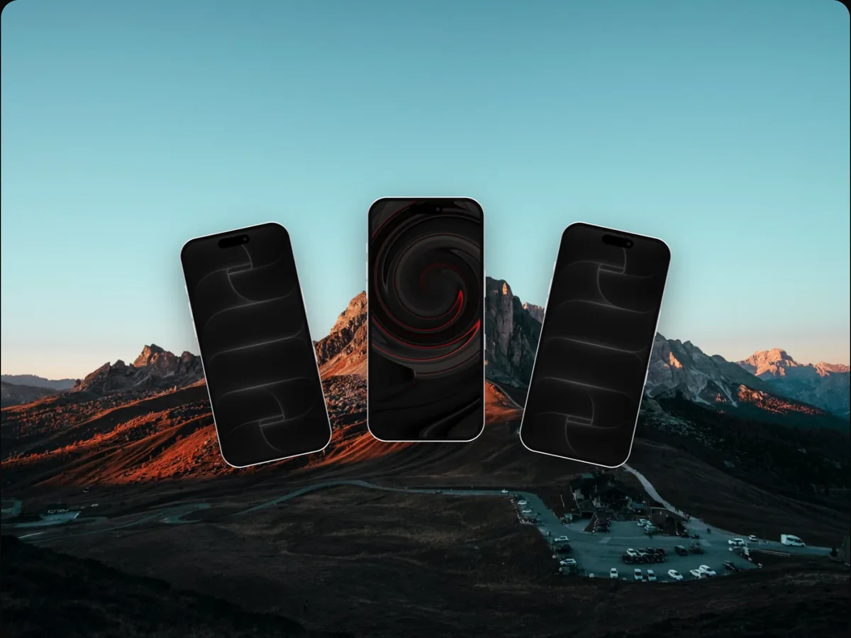
9. Too much perspective or tilt
A dramatic 3D angle can look dynamic, but tilt the screen too far and the UI becomes unreadable. Fix: gentle angles, and a flat or nearly flat view whenever the screen's content matters.
10. Heavy effects
Glows, lens flares, reflections, noise, glitch effects and drop shadows, all at once. Fix: pick one effect at most, and only if it suits your brand. A soft, realistic shadow is usually enough.
Mistakes With Text
11. Unreadable headlines
A headline that looks fine on your 27-inch monitor becomes a grey smudge in a store listing or feed. Fix: check every visual at the size people will see it. If you can't read it on your phone at arm's length, make it bigger or shorter.
12. Too much text
A paragraph of copy next to the device. Nobody reads it. Fix: one headline of five to eight words; move everything else to the description.
13. Feature names instead of benefits
"Smart Sync 2.0" means nothing to a newcomer. Fix: write what the feature does for them: "Your notes, on every device."
Mistakes Across the Set
14. Mixed styles
Screenshot one has a blue gradient and a realistic phone; screenshot two has a white background and a flat outline; screenshot three uses a different font. Fix: one device, one background system, one type style, one headline position, across the whole set.
15. Not checking in context
The mockup looks great in the editor and wrong where it's published: cropped by the store, drowned in the feed, compressed by the social network. Fix: preview every visual where it will live, at its real size, before you ship it.
A Quick Mockup Checklist
Run through this before you export anything:
| Check | Question |
|---|---|
| Status bar | Clean battery, signal and time? |
| Data | Realistic, attractive, no placeholders or real personal data? |
| Screen | The screen that proves your point, captured at the right size? |
| Device | The one your audience uses, and current? |
| Background | Supports the screen instead of competing with it? |
| Effects | One at most, and on-brand? |
| Text | One short headline, readable at real size? |
| Set | Same device, background and type across every image? |
Why These Details Matter So Much
Individually, each mistake seems trivial. But people use shortcuts to judge quality, especially for products they haven't tried. Polish in the visuals suggests polish in the product; sloppiness suggests the opposite, fairly or not.
You don't need expensive effects to look established. You need to remove the small signals that say "unfinished", and apply the same few choices consistently.
How to Audit Your Mockups in 15 Minutes
You don't need to redo everything at once. A quick audit finds the problems that matter most.
- Gather every visual people see: store screenshots, landing page hero, social profile images, the latest launch post, your press kit.
- Put them side by side on one screen. Inconsistencies jump out immediately when visuals sit next to each other.
- Shrink them to real size. View store screenshots at search-result size and social images at feed size. Note anything you can't read.
- Zoom into the screens. Look for status bars, placeholder data, personal information and outdated UI.
- Score each visual against the checklist above, and fix the ones people see most first: usually the first store screenshot and the landing page hero.
Most teams find the same two or three problems repeated across every visual, which means one fix, applied consistently, improves the whole set.
Fixing Mockups Without Starting Over
If your current visuals were made in a design tool or a mockup editor, you rarely need to rebuild them from scratch:
- Replace the screen, not the whole composition, when the problem is old UI or fake data.
- Swap the background for a quieter one; the device and text can usually stay.
- Shorten the headline and increase its size.
- Standardise the device, background and type across the set in one pass.
Saving each visual as an editable project rather than only an exported image makes these fixes quick the next time your product changes.
FAQs
What's the most common mockup mistake?
Fake or empty data on the screen. It immediately signals that nobody uses the product. Realistic sample data fixes it in minutes.
Should I use a realistic device or a flat outline?
Either works. The mistake is mixing them. Pick one style and use it across every visual.
How do I choose a background for a mockup?
Start with a solid colour or soft gradient from your brand. The more detailed your screen, the quieter the background should be.
Do mockups need a device at all?
Not always. For documentation and detailed UI, a clean screenshot frame with rounded corners and a shadow is often better than a device that shrinks the screen.
Conclusion
Great products lose trust in small ways: a status bar, a placeholder name, a background that fights the screen. None of it is hard to fix; it just has to be noticed.
Clean the screen, choose the right device, quiet the background, shorten the text, and make the whole set consistent. Your product will look as good as it actually is.
Which of these fifteen did you spot in your own mockups?