By Shaheer Malik · · 7 min read
Screenshot, Mockup or Video? How to Choose the Right Visual for Every Channel
Use a plain screenshot when the reader is already engaged and needs detail (docs, help articles, changelogs), a device mockup when you need to make a first impression or signal what kind of product it is (store listings, landing pages, launch posts), and a short video when you're competing for attention in a feed or need to show an interaction (social media, product galleries, app previews). Most launches need all three, made from the same screens in one consistent style.
Every time you share your product, you make a quick decision, usually without noticing: screenshot, mockup, or video?
Most teams default to whatever they made last. A launch video gets posted everywhere, including places where nobody watches video. A raw screenshot goes into a store listing where it looks unfinished. A device mockup ends up in the docs, adding decoration where people just want to see the button.
Each format has a job it's great at and places where it quietly underperforms. Choosing well isn't about taste; it's about matching the visual to how much attention your audience is giving you and what they need to understand.
In this guide, I'll give you a simple framework for choosing, show which format fits each common channel, and explain how to make all three from one set of screens without tripling your work.
The Attention Framework
Before choosing a format, ask two questions.
Question 1: How much attention does the viewer have?
- Low attention: scrolling a feed, skimming search results, glancing at a gallery. You need to earn attention before you can inform.
- Medium attention: they clicked through to your page or listing and are deciding. You need to explain quickly and credibly.
- High attention: they're already a user, following instructions or looking something up. You need to show exactly what they need, with no decoration in the way.
Question 2: What do they need to understand?
- A result: what the product produces or achieves. Stills work well.
- An interaction: how something is done, such as a drag, an automation or a multi-step flow. Motion works better.
- A detail: where a specific button or setting is. Precise, unframed screenshots work best.
Put those together and the right format is usually obvious.
When a Plain Screenshot Wins
A plain screenshot, cropped and maybe annotated, is the most honest and precise visual you have. Use it when the viewer is already engaged and needs detail.
Best for: documentation, help-centre articles, changelogs, bug reports, internal updates, onboarding tooltips.
What makes it work:
- Crop tightly to the part of the interface that matters.
- Annotate with arrows, highlight boxes or numbered steps when there's something specific to find.
- Blur private data: names, emails, keys.
- Keep it current: an outdated screenshot in the docs causes more confusion than none.
A plain screenshot is a poor first impression, though. In a store listing or a launch post, it looks unfinished and says nothing about what kind of product it is.
When a Device Mockup Wins
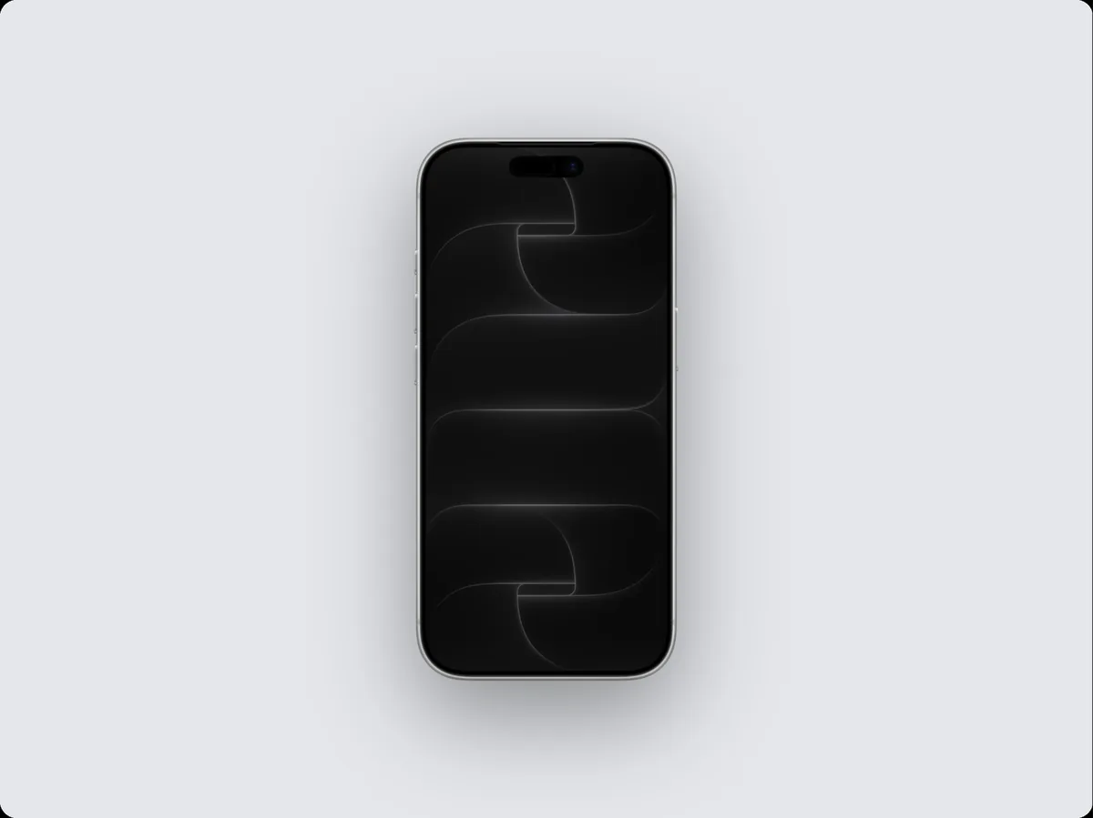
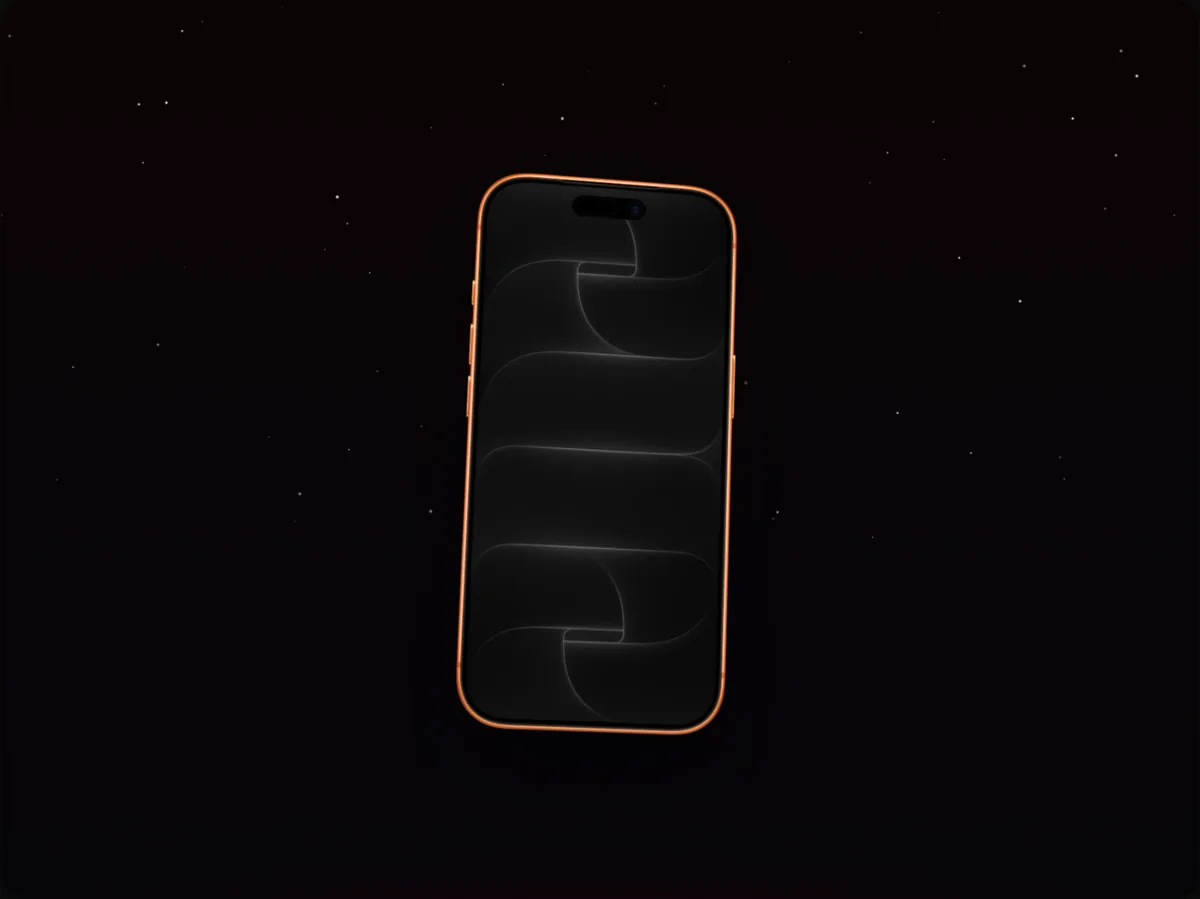
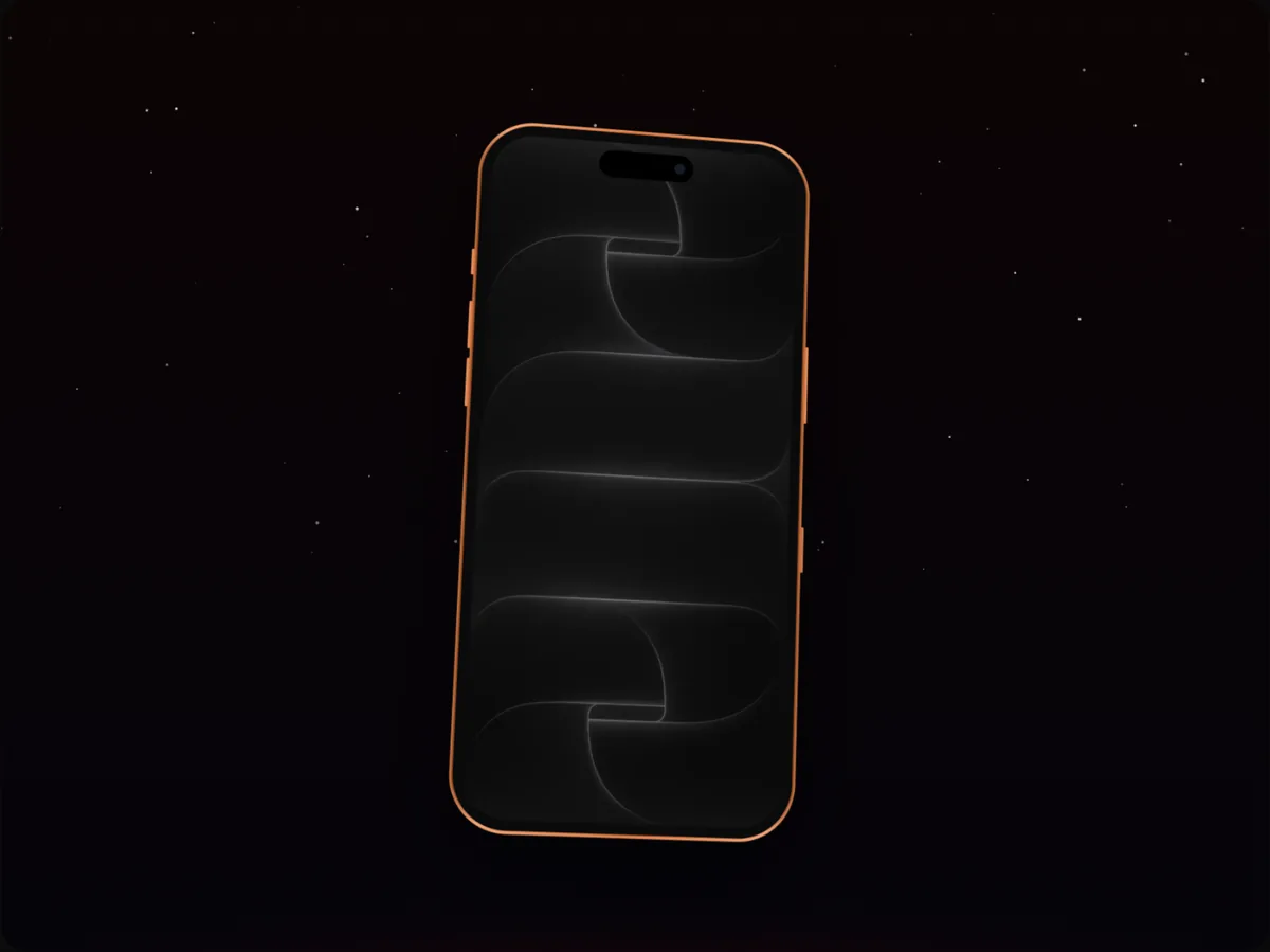
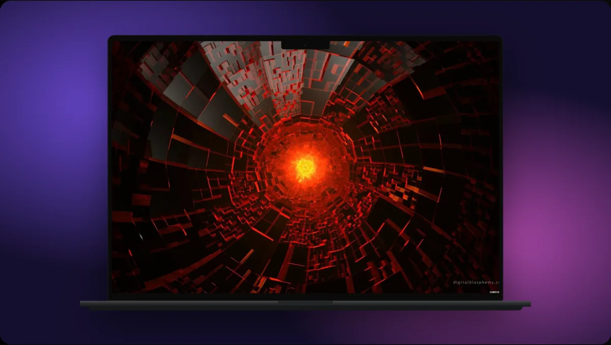
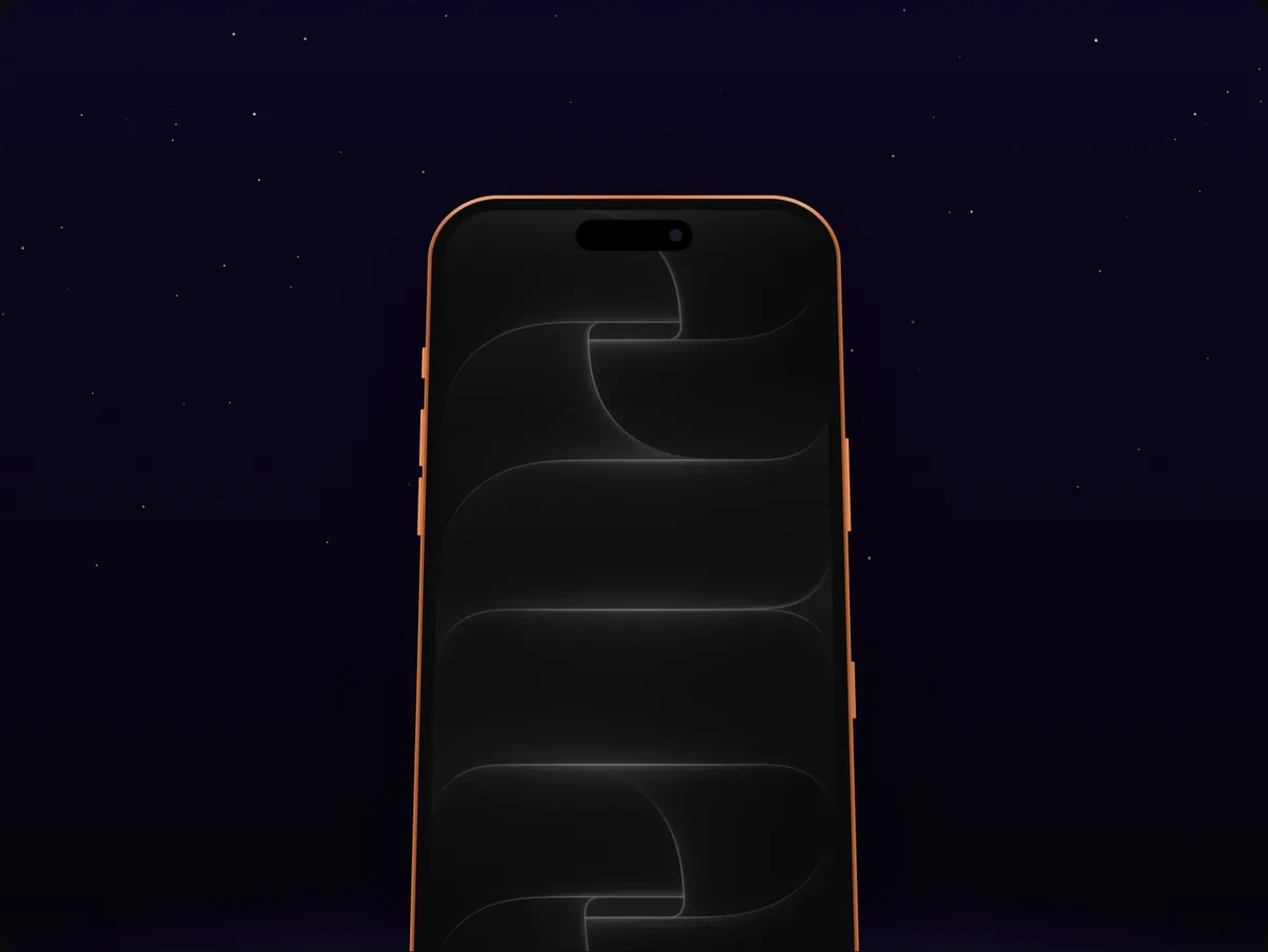
A device mockup puts your screen in context: an iPhone, a laptop, a browser window. It adds almost no information, but it adds a lot of meaning: this is a real product, this is where you use it, and it's been cared for.
Best for: App Store and Google Play screenshots, landing page heroes, launch posts, press kits, pitch decks, portfolio case studies.
What makes it work:
- Match the device to the audience: phones for mobile apps, laptops or browsers for web and SaaS.
- One strong screen, not a collage.
- A quiet background that suits your brand.
- A short headline if it will be seen without surrounding text.
Mockups underperform where people want precision. In documentation, a device frame just shrinks the screen and makes the detail harder to see.
When a Video Wins
Video earns attention where attention is scarce, and it's the only format that can show an interaction happening.
Best for: social feeds (Reels, TikTok, X, LinkedIn), Product Hunt galleries, App Store previews, landing page heroes (as a light loop), feature announcements.
What makes it work:
- Start with the payoff. The first two or three seconds decide whether anyone keeps watching.
- Keep it short: 10 to 30 seconds for most channels.
- Direct the eye with zooms, a cursor and callouts.
- Work without sound: on-screen text carries the message.
Video underperforms where people won't press play or can't wait for it: link previews, email, dense documentation, and places where a 3 MB file slows the page.
The Channel Cheat Sheet
| Channel | Best format | Why |
|---|---|---|
| App Store / Google Play screenshots | Mockup (plus an app preview video) | First impression; context sells |
| Landing page hero | Mockup or light looping video | Explain quickly and credibly |
| Product Hunt gallery | Video first, mockups after | Competing for attention |
| Instagram, TikTok, Reels | Vertical video | Feed attention is scarce |
| X and LinkedIn posts | Short video or wide mockup | Stop the scroll, explain fast |
| Blog posts | Mockups for heroes, screenshots for steps | Mixed attention levels |
| Documentation and help | Plain annotated screenshots | Precision over polish |
| Changelog | Short video or annotated screenshot | Show what changed |
| Still image (link to video) | Video rarely plays inline | |
| Pitch deck | Mockups | Clean, credible, prints well |
One Set of Screens, Three Formats
You don't need to produce three separate asset libraries. Start from one set of clean screens and derive everything else.
Step 1: Capture clean screens once
Realistic data, a tidy status bar, no personal information. These are your source files.
Step 2: Make the mockup
Put the key screens in a device frame on your brand background, with a headline. This is your store screenshot, hero image and launch post.
Step 3: Animate the mockup
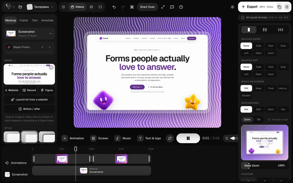
Take the same scene and add motion: a camera push, a cursor that clicks, a callout that draws in. This is your social video and gallery video. In 240fps, the mockup and the video are the same project; switching from Mockup to Videos adds the timeline.
Step 4: Crop for docs
Use the original screens, cropped and annotated, for help articles and changelogs.
Common Mismatches
- A launch video in the docs. Users want the setting, not a 30-second story.
- A raw screenshot in the store. It reads as unfinished.
- A heavy GIF as a hero. It slows the page and looks worse than a light MP4.
- A dense mockup on social. Nobody can read a full dashboard in a phone frame in a feed.
- A video in an email. It usually won't play inline; use a still that links to it.
One Launch, Three Formats: An Example
Imagine you're launching a new calendar app. From one afternoon of capturing clean screens, you produce:
- Mockups: five App Store screenshots in an iPhone frame with benefit headlines, and a landing page hero with a phone and a laptop side by side.
- Videos: a 20-second App Store preview, a vertical 15-second Reel showing "schedule a meeting in 4 seconds", and a 30-second Product Hunt gallery video.
- Screenshots: eight cropped, annotated screenshots for the help centre, showing where each setting lives.
Every piece uses the same screens, the same colours and the same fonts. Nothing was designed twice, and every channel gets the format that suits how people see it.
FAQs
Is a video always better than a static image?
No. Video wins where attention is scarce or you need to show an interaction. Where people need detail, or where video won't play, a clear still is better.
Should every screenshot be in a device frame?
No. Frames help first impressions (stores, landing pages, launch posts). In documentation and help articles, a frame makes details smaller and harder to see.
How long should a product video be?
For social and galleries, 10 to 30 seconds. For App Store previews, 15 to 30 seconds. For landing page loops, 6 to 15 seconds. Longer demos belong on a dedicated page or YouTube.
What's the fastest way to make all three formats?
Capture clean screens once, make one mockup scene in your brand style, animate that same scene for video, and crop the original screens for docs.
Conclusion
Screenshot, mockup or video isn't a style choice; it's a question of attention and understanding. Give engaged users precise screenshots, give first impressions the context of a mockup, and give scrolling audiences motion that points at the payoff.
Make all three from the same screens, in the same style, and every channel gets the visual it needs without extra work.
Which of your channels is currently using the wrong format?