By Shaheer Malik · · 7 min read
How to Announce a New Feature So People Actually Notice
A feature announcement gets noticed when it leads with the problem the feature solves, shows the feature working in a short visual (a 10 to 20 second video or an annotated mockup), and tells people exactly how to try it. Announce it in the places your users already are, in order of intent: in the product first, then email and changelog, then social. Make one visual in your brand style and adapt it to each channel instead of writing separate posts from scratch.
You shipped something good. It took weeks. The team is proud of it.
You post about it, add a changelog entry, maybe send an email. And then... almost nothing. A few likes. A handful of people try it. Support tickets keep asking for the very thing you just built.
It's one of the most frustrating patterns in product work: features that exist but aren't known. And it usually isn't because the feature is wrong. It's because the announcement explained what was built instead of showing why anyone should care.
In this guide, I'll show you how to frame a feature announcement around the user's problem, make a visual that explains it in seconds, and roll it out across channels so it actually reaches people.
Why Most Feature Announcements Get Ignored
They describe the build, not the benefit
"We've added configurable webhook retries with exponential backoff." Accurate, and invisible to everyone who doesn't already know why they'd want it. Your users don't think in features; they think in problems they have.
They're text-only
A paragraph in a changelog asks people to imagine the feature. Most won't. A short visual lets them see it, which takes a fraction of the effort.
They don't say how to try it
"Now available!" with no link, no location and no first step. Curiosity dies in the gap between reading and finding.
They appear once, in one place
A single post on one channel reaches a small slice of your users, at whatever moment they happened to be looking.
Step 1: Frame It Around the Problem
Before writing a word, answer three questions:
- What was annoying, slow or impossible before?
- What can someone do now that they couldn't?
- Who is this for? (Everyone? Admins? Power users?)
Then write the announcement headline from the user's side:
| Build-focused | Problem-focused |
|---|---|
| "Bulk editing for invoices" | "Update 100 invoices in one go" |
| "New export API endpoints" | "Get your data into any tool, automatically" |
| "Dark mode" | "Easier on your eyes at night" |
| "Improved search indexing" | "Find anything in under a second" |
The feature name can still appear; it just shouldn't lead.
Step 2: Show It Working
The best feature announcements are visual. You have two good options.
Option A: A short video (10 to 20 seconds)
Best when the feature is an interaction: a drag, an automation, a before-and-after.
- Start on the result, then show how you get there.
- Point at the change with a zoom into the new button, a cursor that clicks it, or a highlight that draws around it.
- One sentence on screen: your problem-focused headline.
- Loop-friendly: it will autoplay in feeds and changelogs.
Option B: An annotated mockup
Best when the feature is a new screen, setting or piece of information.
- The relevant screen in a device or browser frame.
- A box or arrow on the new thing.
- One short label.
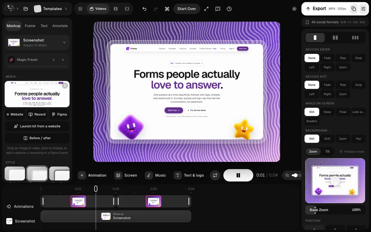
Annotation tools let you add highlight boxes, arrows and speech bubbles that stay pinned to the screen, so the same scene can become a still for email and a video for social.
Step 3: Tell People Exactly How to Try It
Every announcement needs a concrete next step:
- A direct link to the feature, not just the homepage.
- Where it lives: "Settings → Automations → Retries".
- Who has it: all plans, or only some.
- What to do first: "Select several invoices and press Edit."
Step 4: Roll It Out Across Channels
Different users see different channels. Announce in order of intent, from people using the product right now to people who've never heard of it.
| Channel | Audience | Format |
|---|---|---|
| In-product (tooltip, banner, "What's new") | Active users, right now | Short text + small visual, linking to the feature |
| Users who aren't active this week | Still image with headline, linking to the video | |
| Changelog | Engaged users and prospects checking progress | Video or annotated mockup + details |
| Social (X, LinkedIn, Reels) | Followers and prospects | Short video that works without sound |
| Blog post (for big features) | Search traffic and prospects | Full story, screenshots, use cases |
Adapt one visual, don't remake five
Make the core visual once, in your brand style, then resize it: square for LinkedIn, vertical for Reels, wide for X and the changelog. The headline and screen stay the same; only the layout changes.
Step 5: Measure Adoption, Not Likes
A popular post that nobody acts on didn't work. Track:
- Feature adoption: how many active users tried it within a week or two.
- Traffic from each channel to the feature link.
- Support questions about the problem the feature solves: they should drop.
If adoption is low, the announcement usually failed at step 1 (people didn't see the problem it solves) or step 3 (they couldn't find it).
Big Features vs Small Improvements
Not everything deserves the full treatment.
- Big features that change how people use the product: the full rollout, a dedicated video, a blog post, and a follow-up a few weeks later with real examples.
- Medium features: an in-product note, a changelog entry with a visual, and a social post.
- Small improvements: batch them into a monthly "what's new" roundup with a few short clips.
Batching small improvements makes each roundup feel substantial and keeps your announcement channels from becoming noise.
A Feature Announcement Template
Use this structure for changelog entries and social posts:
- Headline: the problem it solves, in the user's words.
- Visual: 10 to 20 second video or annotated mockup.
- One or two sentences: what you can do now, and who it's for.
- How to try it: a link and the first step.
- (Optional) Why we built it: the story behind it, briefly.
A Worked Example
Let's walk through a realistic announcement: a project management app ships bulk editing for tasks.
The framing
- Problem: updating the due date on 40 tasks means opening 40 tasks.
- Now: select them all and change the date once.
- Who: everyone, on every plan.
Headline: "Update 40 tasks in one go."
The visual
A 15-second video in the app's usual style:
- The task list, with the cursor shift-clicking to select a range (3 seconds).
- A zoom into the bulk-edit bar as it appears, with a highlight box drawing around it (4 seconds).
- The cursor choosing a new due date; every selected task updates at once (5 seconds).
- Pull back to the updated list, holding for a moment with the headline (3 seconds).
The rollout
- In-product: a small "What's new" note with the first frame of the video and a link to try it.
- Email: the headline, a still image and a link to the changelog video.
- Changelog: the video, two sentences, and the exact steps.
- Social: the same video cut to square and vertical.
The result to watch
Within two weeks, the team checks how many active users used bulk edit, and whether support requests about "changing many tasks" drop.
FAQs
Should every feature announcement have a video?
No. Use video when the feature is an interaction or a before-and-after. For a new screen or setting, an annotated mockup is faster to make and just as clear.
How long should a feature video be?
10 to 20 seconds is enough for most features. Start on the result, show the key interaction, and end on a readable frame.
Where should I announce a new feature first?
Inside the product, where active users can try it immediately. Then email and your changelog, then social media.
How do I make announcement visuals consistent?
Use the same device, background, fonts and headline style every time. A saved template, or a brand kit that applies your logo and colours in one click, keeps every announcement recognisable.
Conclusion
Features don't sell themselves; announcements do. Lead with the problem, show the feature working in a few seconds, tell people exactly how to try it, and put the announcement where your users already are.
Do that consistently, and "we built that months ago" becomes "people actually use that."
What's the last feature you shipped that deserved a better announcement?